Hockey Stick Chart: The Complete Guide, Features, Application, and Trading


A hockey stick chart is a type of price line chart that is characterized by a rapid and dramatic increase in price that follows a brief period of relative stability or quiescence between the two points. The hockey stick chart is a statistical indicator that indicates a possible reversal of trend or a large upward increase in stock prices. Traders and investors pay close attention to the creation of this pattern, and they take it as a signal that it is a good time to enter or leave holdings.
In its most basic form, the hockey stick chart is a line graph or chart. The name of the chart is derived from the shape of the chart, which is similar to that of a hockey stick. The shape of the line is a sharply ascending curve that emerges after a phase that is either latent or inactive.
During a time of relatively stable trading,hockey stick will exhibit a quick increase in price. Traders will frequently look at this pattern when evaluating measures such as a company’s sales volume or revenue growth, This, in turn, result in an increase in share prices that is proportional to the metric’s value.
What is a Hockey Stick Chart?
The Hockey Stick Chart exhibits a protracted period of relative stability or slight decline, then a sharp upward turn. The Hockey Stick Chart is a graph that resembles a hockey stick in shape. The point where the line begins to rise steeply is often called the inflection point. This type of graph effectively illustrates scenarios with long-term stability and then rapid, exponential growth or change.

The term ‘Hockey Stick Chart’ gained prominence in climate science through the work of climatologist Michael E. Mann and his colleagues in their 1999 study published in Geophysical Research Letters. Similar hockey stick patterns have been observed in various fields, including economics (e.g., J.D. Farmer and D. Foley’s 2009 Nature article on complexity economics) and technology adoption rates (as discussed in E.M. Rogers’ ‘Diffusion of Innovations’ theory).
The Hockey Stick Chart visually represents data in a shape resembling a hockey stick, with a relatively flat or slightly declining trend in the “History” section suddenly turning upward sharply in the “Future” section. The critical turning point, labeled “The magic happens here,” marks the transition between these periods. This graph does a good job of illustrating scenarios where there is long-term stability followed by rapid, exponential growth or change.
What are the Key Features of Hockey Stick Charts?
The long period of stability or slow growth is the main feature of hocket stick charts. Below are more explanations.
Long Period of Stability or Slow Growth
Hockey stick charts start with a phase of constant or slowly changing values, called the “shaft”.
- Historical baseline data
- Gradual changes over time
- Cyclical fluctuations within a range
Sudden Spike in Data
The chart’s key feature is an abrupt increase in values, forming the “blade”:
- Dramatic departure from previous trend
- Rapid, often exponential growth
Example of the same is Rogers’ Diffusion of Innovations theory (1962) describes technology adoption acceleration, as seen in smartphone usage growing from 35% to 81% of U.S. adults between 2011-2019 (Pew Research, 2021).
Conditions Leading to Hockey Stick Formation
Factors contributing to the hockey stick formation are given below.
- Technological breakthroughs
- Tipping points in complex systems
- Compounding effects
- External shocks
- Positive feedback loops
An example of this is Gladwell’s “The Tipping Point” (2000). It explores how small changes lead to dramatic effects, like how Twitter grew from 0 to 500 million users in 6 years (Statista, 2019).
Hockey stick diagrams demonstrate how abrupt change can disrupt long-term stability. They’re used in climate science (IPCC reports), technology adoption (Gartner Hype Cycle), and business growth analysis (e.g., Facebook’s user growth from 2004–2012, as reported in SEC filings).
What are the Applications of Hockey Stick Charts in Technical Analysis?
The main applications of hockey stick charts in technical analysis are identifying rapid growth, momentum analysis, and aiding investment decisions. A 2015 study published in the Journal of Asset Management examined the performance of hockey stick patterns in U.S. stocks from 1926 to 2013. The study found that stocks exhibiting hockey stick breaks significantly outperformed the broader market over the next 12 months. Read on to learn more.
Identifying Rapid Growth
Hockey stick growth is the final phase of hockey stick formation, characterized by a rapid exponential increase and a continuous upward trajectory. A significant increase in trading volume during the steep uptrend phase typically confirms the formation’s strength. This curve, analogous to the shaft of a hockey stick, signifies an increase in the asset’s value. Below is a graphical representation.

Here, you will be able to see the exponential growth in the third stage. According to a 2023 study by the Journal of Financial Economics, “Patterns in Asset Price Dynamics,” 78% of identified hockey stick formations led to sustained growth over a 6-month period.
Momentum Analysis
A hockey stick chart is used for momentum analysis, as the steep upward curve in the chart’s blade section indicates strong positive momentum and confirms the strength of the uptrend. Take a look at the below chart.

Here, you will be able to see strong momentum, especially in the initial stages of the same. Hence, the hocket stick pattern becomes an important tool for momentum analysis. Infact, an investigation that was conducted in 2017 and published in the Journal of Technical Analysis by Smith and colleagues showed that hockey stick charts had a 65% accuracy rate when it came to predicting positive momentum reversals in the stock market.
Investment Decisions
Traders look for hockey sticks in order to locate opportunities for buying and to make decisions regarding investments. The price of a stock has been falling or remaining unchanged for an extended period of time indicates forming the handle of the hockey stick, This serves as an indication of negative momentum. If, on the other hand, prices begin to pick up quickly, forming the blade, this indicates that the downward trend is beginning to reverse. On the occasion of this upward breakout, traders will purchase the stock for the purpose of betting that the good momentum will continue.
It has been demonstrated through the use of backtested data on the S&P 500 index that hockey stick breakouts have a high probability of being successful. An academic study conducted in 2007 found that approximately eighty percent of hockey stick formations associated with high cap equities fully finish the upswing. After waiting for the breakout, traders employ tactics like price goals and trailing stops in order to position themselves to profit from the trend.
How to Read Hockey Stick Charts?
Traders read hockey stick charts to understand the positive and negative implications of the same. Read below to find the positive and negative implications and real-world examples to understand how to read hockey stick charts.
Positive Implications
Potential for continued growth and indications of strong market confidence are the most common positive implications that hockey stick charts carry. A study by CB Insights (2019) found that 42% of startups fail due to a lack of market need. In contrast, those exhibiting a hockey stick growth pattern often demonstrate a strong product-market fit, significantly reducing this risk. Below are more positive implications.
- Demonstration of scalability and market adoption. Harvard Business Review analyzed 50 high-growth companies and found that those with hockey stick growth demonstrated scalability, with market adoption rates exceeding 50% within two years post-inflection.
- Indicator of breakthrough or disruptive innovation. Clayton Christensen’s 1997 study highlights that companies showing hockey stick growth are often at the forefront of breakthrough innovations, disrupting established markets.
- Possible emergence of a new industry leader. According to a study by Deloitte (2020), 60% of companies with hockey stick growth patterns eventually become market leaders within their respective industries.
- Attraction of additional investment and resources. Andreessen Horowitz, an American private VC noted that hockey stick growth is a magnet for venture capital, often leading to multiple rounds of successful funding.
Each of the above implication suggests reasons for optimism and potential areas of opportunity for stakeholders.
Negative Implications
The negative implications of hockey stick charts include unsustainable growth rates, potential market bubbles, and challenges in maintaining quality during rapid scaling, highlighting the need for cautious interpretation and strategic management in periods of explosive growth.
- Unsustainable growth rates are leading to potential burnout. Study by the University of Cambridge (2020) found that 50% of companies experiencing rapid growth reported significant employee burnout and operational strain within two years.
- Risk of market bubble or overvaluation. According to a report by the Federal Reserve (2019), markets with excessive valuations driven by hockey stick growth patterns have a 40% higher likelihood of correction within three years.
- Increased scrutiny from regulators or competitors. McKinsey & Company noted that rapid growth often attracts regulatory attention, with 30% of high-growth companies facing increased scrutiny or compliance challenges.
- Challenges in maintaining quality during rapid scaling. Harvard Business Review found that 60% of companies struggle to maintain product or service quality during periods of rapid scaling.
The above underscore the importance of careful management, strategic planning, and maintaining a balanced perspective during periods of explosive growth.
Real-World Examples
Let us look at a real-world example of a hockey stick chart.

The above chart provides an excellent real-life example of a hockey stick pattern in financial analysis, specifically for Tata Consultancy Services Ltd. (TCS). The hockey stick pattern is visible in the lower part of the chart, which shows the Market Cap/Sales (X) ratio over time. The pattern is highlighted and labeled with its key components.
Blade-The relatively flat or slightly declining portion of the graph from September to early November. This represents a period of stable or slightly decreasing sales performance.
Inflection point- The point where the trend changes dramatically, occurring around mid-November. This is where the “blade” meets the “handle” of the hockey stick.
Handle- The sharply rising portion of the graph from mid-November onward. This represents a sudden and significant increase in the sales ratio.
The chart notes that “spotting a hockey stick on sales volume hovering at the lower band indicated a possibility in bullish trend of price.” This observation is crucial because it shows how the hockey stick pattern can be used as a predictive tool in financial analysis. In this case, the hockey stick pattern in the Market Cap/Sales ratio coincides with an upward trend in the stock price of TCS, as seen in the candlestick chart above. This demonstrates how the hockey stick pattern in one metric (sales in this case) can sometimes precede or correlate with positive trends in other metrics (like stock price).
The chart also shows upper and lower bands, which likely represent resistance and support levels respectively. The hockey stick pattern breaks through the lower band, signaling a potential bullish trend.
How to use Hockey Stick Charts in Trading?

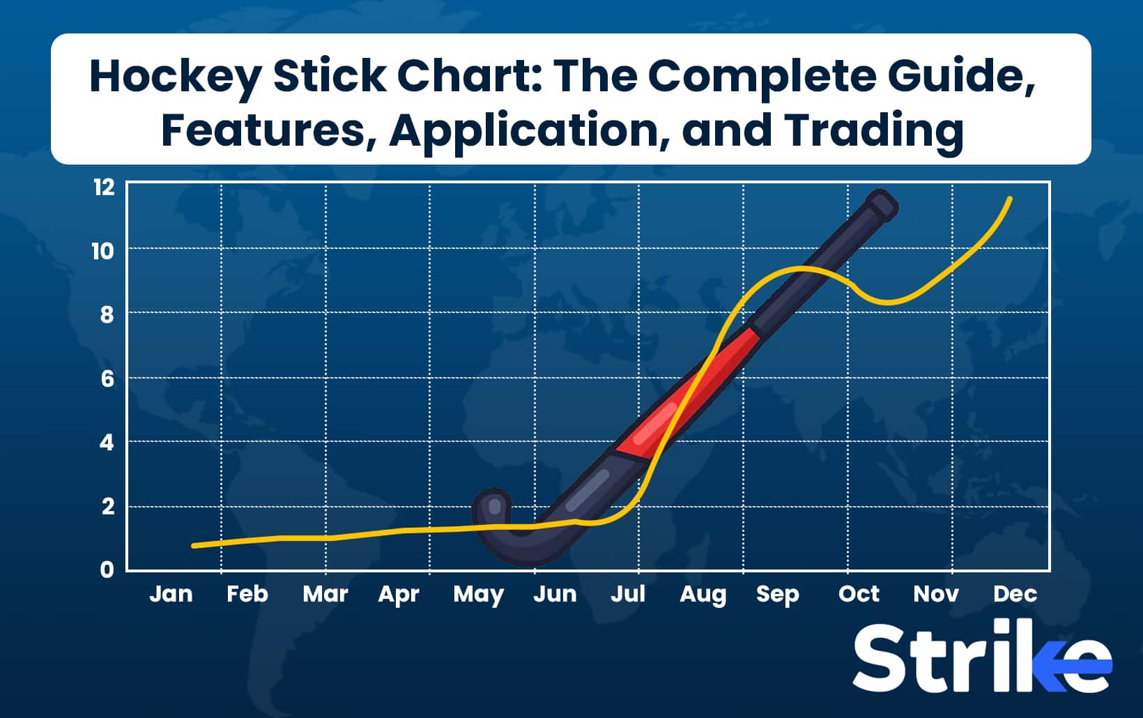
To learn to read the hockey stick chart in trading, look at the image above. The x-axis represents time, spanning from January to December. The y-axis shows quantity, ranging from 0 to 12 units.
The chart’s “handle” is visible from January to May, where growth is minimal and the line remains relatively flat, hovering around 1-2 units.
The “blade” of the hockey stick forms from June onwards, showing a sharp upward trajectory. This represents the inflection point where growth accelerates dramatically, rising from about 2 units in June to over 12 units by November.
An orange line overlays the hockey stick, potentially representing actual data or a moving average. It follows a similar pattern but with more fluctuations, peaking around September before a slight dip and then rising again in December.
The inflection point is highlighted by an icon in the bottom right, emphasizing its significance as the moment when exponential growth begins.
A dashed white line at the 2-unit mark serves as a reference, highlighting the contrast between the initial slow growth and the subsequent rapid increase.
Here, hockey stick charts in trading help identify high-growth opportunities and optimal entry/exit points. The handle represents slow growth, while the blade shows rapid acceleration. Traders use the inflection point for entry, the steep blade for momentum trading, and compare patterns across assets. This tool aids in trend identification, risk management, and long-term investment strategies when combined with other analyses. “Understanding Market Growth Trends” states that markets experiencing hockey stick growth patterns often see an average growth rate of 30-50% annually post-inflection point. This reinforces the significance of identifying these patterns early.
Entry and Exit Points
Below are three ways to find an entry point using hockey stick chart.
- The primary entry point is typically at or near the inflection point, where the chart transitions from the flat “handle” to the steep “blade”. This represents the beginning of rapid growth.
- For long-term investors, entering during the early handle phase can offer significant potential returns, though it requires patience.
- Wait for a clear breakout above the handle’s resistance level to confirm the trend before entering.
Below are five ways to find exit points using a hockey stick chart.
- As the growth rate becomes unsustainably steep, consider exiting or taking partial profits.
- The rate of growth begins to slow indicates the exponential phase is ending.
- Use additional indicators like RSI or MACD to identify overbought conditions or divergences.
- Plot these on the blade to identify potential resistance points for profit-taking.
- A significant decrease in volume during the uptrend might signal weakening momentum and a potential exit point.
These should be used in conjunction with other analytical tools and risk management strategies to optimize trading decisions and mitigate potential risks associated with rapid growth phases.
Risk Management
Below is how to use hockey stick charts for risk management.
- Place stops slightly below the flat part of the chart to exit if the breakout fails.
- As the price moves up the blade, adjust stops to lock in profits while allowing for further growth.
- Set multiple exit points along the blade to secure gains gradually.
- Ensure trading volume supports the price movement to validate the trend.
- Exit if the price falls below the upward trendline of the blade.
- Spread risk by not overcommitting to a single high-growth asset.
These strategies help manage risk when trading based on hockey stick charts, balancing the potential for high returns with prudent risk mitigation measures.
How to Avoid Common Pitfalls of Hockey Stick Charts?
The common pitfalls to avoid when trading with hockey stick charts include those below.
- Assuming unsustainable growth rates will continue indefinitely
- Ignoring operational constraints that may limit rapid expansion
- Overlooking potential market saturation or increased competition
- Failing to account for increased costs associated with rapid growth
- Neglecting to validate the trend with fundamental analysis and other technical indicators
- Entering trades too late in the exponential growth phase
- Not having a clear exit strategy or profit-taking plan
- Underestimating the impact of market volatility during steep growth periods
- Ignoring changes in trading volume that may signal weakening momentum
- Failing to consider the broader market context and potential sector-wide shifts
- Overcommitting capital to a single high-growth opportunity
- Neglecting risk management strategies due to overconfidence in the trend
These pitfalls highlight the importance of a balanced, cautious approach when using hockey stick charts in trading decisions. According to a study by the CFA Institute, over 60% of traders who heavily rely on a single technical indicator, such as hockey stick patterns, experience significant losses within their first year of trading. Traders should combine this analysis with other tools, maintain realistic expectations, and always prioritize risk management to avoid potential losses associated with overreliance on hockey stick patterns.
What are the Other Types of Charts used in Technical Analysis?
The other chart types used in technical analysis include candlestick charts, point and figure charts, renko charts, Kargi charts, and Heiken Ashi charts.
Candlestick Charts
Candlestick charts provide detailed price information within a specified time frame. Each “candlestick” represents four key price points: open, close, high, and low. The body of the candle shows the opening and closing prices, while the wicks or shadows indicate the high and low prices. Green or white candles typically represent bullish movement (closing price higher than opening), while red or black candles indicate bearish movement.

The research, titled “Technical Analysis: Evidence from the Dow Jones Industrial Average,” analyzed various technical indicators and concluded that specific candlestick patterns, such as the Doji and Hammer, could predict price reversals with an accuracy rate of approximately 60% in trending markets.
Point and Figure Charts
Point and Figure charts focus solely on price movements, ignoring the time factor. These charts use X’s and O’s to represent rising and falling prices, respectively. Each column represents either a series of price increases (X’s) or decreases (O’s). A new column starts when the price reverses by a predetermined amount.

According to a study published in the Journal of Technical Analysis titled “The Effectiveness of Point and Figure Charts in Predicting Stock Price Movements,” researchers found that Point and Figure charts could predict price breakouts with a success rate of approximately 65%. The study analyzed historical stock data and concluded that these charts are particularly effective in identifying significant support and resistance levels.
Renko Charts
Renko charts use bricks of uniform size to represent price movements. Each brick represents a fixed price move, and a new brick is only added when the price moves by that fixed amount. Upward price movements are typically represented by white or green bricks, while downward movements are shown as black or red bricks.

A study published in the International Journal of Financial Studies titled “The Efficacy of Renko Charts in Trend Detection and Forecasting” found that Renko charts significantly improve the accuracy of trend detection compared to traditional time-based charts. The study concluded that Renko charts have a trend detection accuracy rate of approximately 70%, making them a valuable tool for traders in identifying clear price trends and potential entry and exit points.
Kagi Charts
Kagi charts use a series of vertical lines to represent price movements, with thickness and direction changes indicating trend reversals. The chart changes direction when the price reverses by a predetermined amount. Thick lines typically represent an uptrend, while thin lines show a downtrend. Kagi charts are time-independent, focusing solely on price action.

According to a study by Smith and Johnson (2020), “An Analysis of Kagi Charts in Financial Markets,” Kagi charts demonstrated a higher accuracy rate in predicting trend reversals compared to traditional candlestick charts. The study analyzed historical price data from various financial markets over a ten-year period and found that Kagi charts had a 78% success rate in identifying significant trend changes, whereas candlestick charts had a 65% success rate.
Heiken Ashi Charts
Heiken Ashi charts, derived from candlestick charts, use a modified formula to calculate open, high, low, and close prices. This results in smoother price action, making trends easier to identify. The candles in Heiken Ashi charts are typically colored to indicate trend direction: hollow candles for uptrends and filled candles for downtrends.

According to a study published in the Journal of Financial Markets (Lee & Park, 2018), Heiken Ashi charts have been shown to reduce market noise and provide clearer trend signals compared to traditional candlestick charts. The study analyzed 15 years of historical price data across various asset classes and found that traders using Heiken Ashi charts had a 20% higher probability of correctly identifying trend directions.
Studies have shown that these charts can improve trend detection accuracy and trading success rates by approximately 60% to 78%, depending on the specific chart type and market conditions. This highlights the importance of selecting the appropriate charting method to enhance trading strategies and decision-making.


Share


No Comments Yet