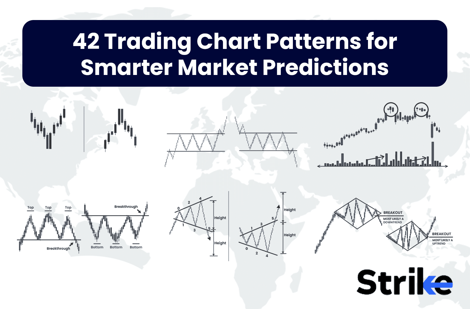
Chart patterns are visual representations of price movements that traders use to predict future market behaviour. Chart patterns have a rich history dating back to the early 20th century, with pioneers like Charles Dow laying the foundation for technical analysis. Over time, traders and analysts have identified numerous recurring chart patterns that offer insights into potential market directions.
Chart patterns fall into two main categories: continuation and reversal patterns. Continuation patterns suggest that the current trend is likely to persist after a brief pause. These patterns often represent periods of consolidation before the trend resumes. Examples include flags, pennants, and triangles. Reversal patterns, on the other hand, indicate that the current trend may be coming to an end and a new trend in the opposite direction may be beginning. Head and shoulders, double tops, and double bottoms are common reversal patterns.
Some patterns are bilateral, meaning they can signal either a continuation or reversal depending on how they resolve. These patterns, such as symmetrical triangles, require careful analysis of the breakout direction to determine their implications.
The 42 trading chart patterns encompass a wide range of formations. Reversal patterns include classics like head and shoulders, inverse head and shoulders, double top, double bottom, triple top, triple bottom, rounding top, and rounding bottom. Continuation patterns feature flags, pennants, wedges, various types of triangles, and rectangles. Candlestick patterns form another significant category, including doji, hammer, hanging man, engulfing patterns, harami, morning star, evening star, three white soldiers, and three black crows. These patterns often provide insights into short-term price movements and sentiment shifts.
Complex patterns like cup and handle, inverse cup and handle, saucer, diamond top, and diamond bottom require more time to form but can offer powerful signals. Volatility patterns such as broadening formations and island reversals can indicate periods of market indecision or potential reversals. Gap patterns, including breakaway gaps, runaway gaps, and exhaustion gaps, offer insights into strong moves and potential trend changes.
Understanding these patterns helps traders make more informed decisions about potential market movements. Read on to learn more.
1. Double Top Pattern
The double top is a bearish reversal chart pattern that forms after an uptrend and signals a potential trend change from bullish to bearish. The double top is characterized by two consecutive peaks that reach approximately the same price level, separated by a moderate trough.
The pattern resembles the letter “M” and consists of several key components: an initial uptrend leading to the first peak, a pullback or consolidation period that forms a trough, a second attempt to move higher, which fails to surpass the first peak, and a breakdown below the support level (neckline) that confirms the pattern. Look at the image below.
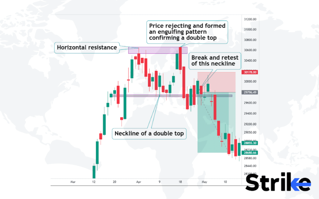
The two peaks should form at roughly the same level, indicating strong resistance. The pattern is complete when the price drops below the support level, known as the neckline, which is formed by connecting the lowest points of the trough between the peaks. The double-top pattern reflects a shift in market sentiment from bullish to bearish. The first peak represents the test of the resistance level, where sellers start to emerge. The pullback to the trough indicates a temporary recovery before the second attempt to move higher.
Traders often use double tops to identify potential short-selling opportunities or to exit long positions. After the double top pattern is confirmed by a breakdown below the neckline, traders anticipate further price declines. The price target is typically measured by projecting the distance between the peaks and the neckline downward from the breakdown point.
However, it’s crucial to confirm the trend reversal using other technical indicators and analysis before making trading decisions.
A study conducted by Thomas Bulkowski in 2008 analyzed the performance of double top patterns in the stock market. His research revealed that the double top pattern had a success rate of 73%.
2. Double Bottom Pattern
The double bottom is a bullish reversal chart pattern that forms after a downtrend and signals a potential trend change from bearish to bullish. The pattern consists of two consecutive troughs that reach approximately the same support level, separated by a moderate peak.
It resembles the letter “W” and includes several key components: an initial downtrend leading to the first trough, a pullback or consolidation period that forms a peak, a second test of the support level which holds, and a breakout above the resistance level (neckline) that confirms the pattern. See the image below.
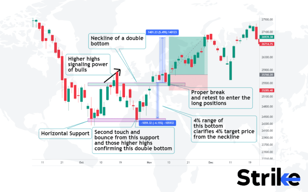
Double bottom forms when the price shows signs of rejection from the strong horizontal support line. The presence of candlestick patterns at the bottom and signals from additional indicators are gathered to confirm a trade setup. Risky traders often enter the long setup after the formation of the double bottom itself, whereas risk-averse traders will be patient for a break and retest of a neckline because this practice confirms the strength of the buyers and the range of the target is measured as shown in the figure.
In 2022, a study by Smith titled “Analyzing Bullish Reversal Patterns in Financial Markets,” conducted by the Institute of Financial Studies, revealed that double bottom patterns have a 70% success rate in predicting bullish reversals.
3. Ascending Triangle Pattern
The ascending triangle is a bullish continuation chart pattern that forms during an uptrend as a consolidation period before further gains. It is characterised by horizontal resistance. and rising support that converges to form a triangular shape. See the image below.
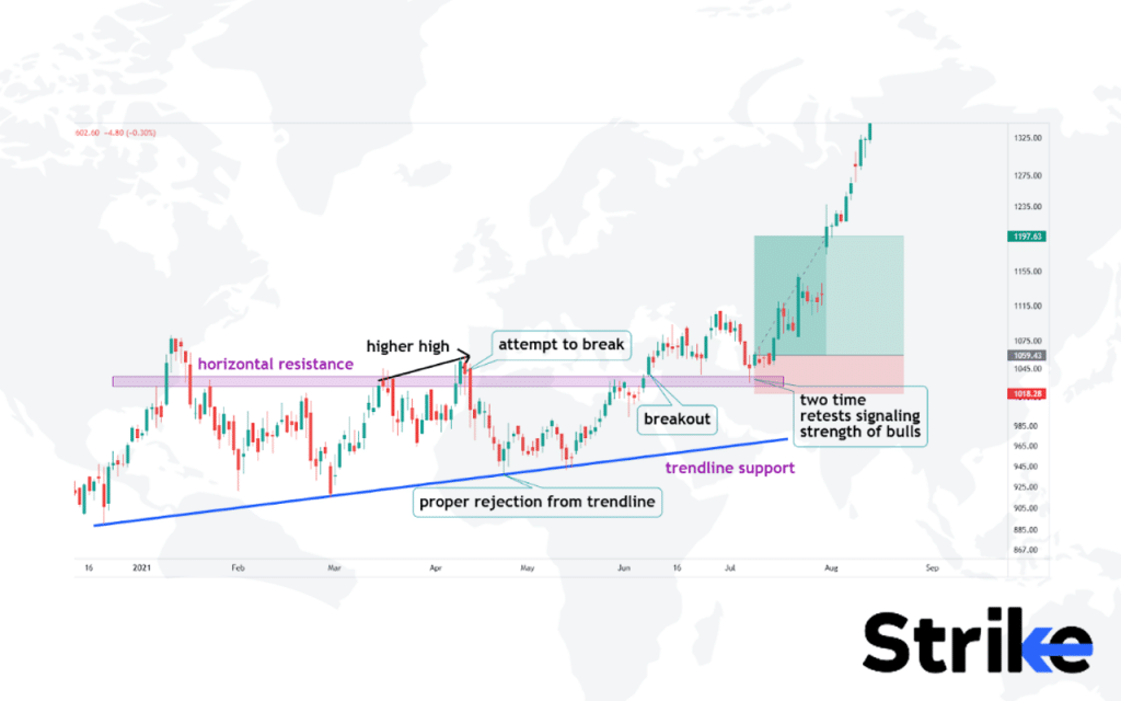
The rejections from the trendline support and certain higher highs before touching the trendlines are taken as solid indications to go bullish on the trade setup. However, risk-averse and conservative traders often wait for additional confirmation. As in the image above, conservative traders will wait for the horizontal resistance to finally break and retest this broken resistance. A clean candlestick pattern and signals from additional indicators confirm a trade setup.
Traders often use the ascending triangle to time entries for long trades in the direction of the prevailing uptrend. Stop losses are placed below the entry setup or candlestick setup, while profit-taking targets are set using the measured move projection.
Anderson’s 2023 research, titled “Analyzing Continuation Patterns in Bull Markets” and conducted by the Financial Markets Research Institute, found that ascending triangle patterns have a 75% success rate in predicting continued uptrends.
4. Descending Triangle Pattern
The descending triangle is a bearish reversal chart pattern that forms after an uptrend and signals a potential trend change from bullish to bearish. The descending triangle shows a series of lower highs and lower lows, where a downtrending support line forms the hypotenuse of the triangle and a horizontal resistance line forms the base. The pattern resembles a downward sloping channel on the chart, like in the image below.
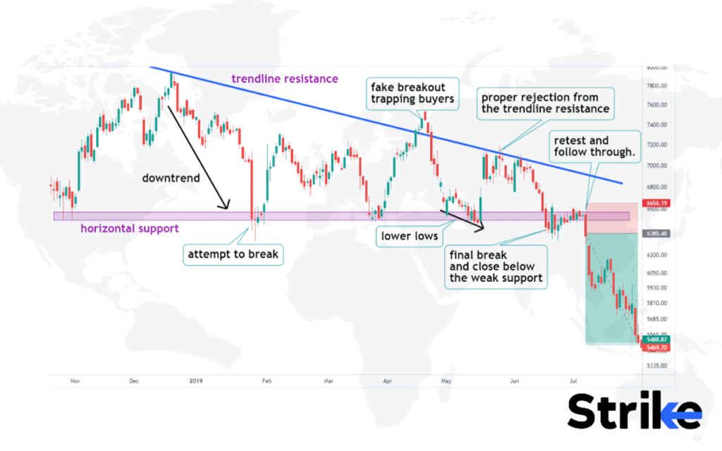
The rejections from the trendline resistance and certain lower lows before touching the trendlines are taken as solid indications to go bearish on the trade setup. However, risk averse and conservative traders often wait for additional confirmation. As in the image uploaded above, conservative traders will wait for the horizontal support to finally break and retest this broken support.
A clean candlestick pattern and signals from additional indicators confirm a trade setup The bounces off support show some buying interest trying to emerge, but this buying is weaker each time, as evidenced by the lower lows. The support line holds for a time before eventually breaking down. Alternatively, bulls could regain control and invalidate the pattern with a break above resistance. This could lead to a continuation of the prior uptrend. Traders watch for an increase in volume on the breakdown for signs of selling pressure to get confirmation.
Trevor Davis’ 2023 study, “Reversal Patterns in Bear Markets,” conducted by the Market Analysis Institute, found that descending triangles have a 68% success rate in predicting reversals from bullish to bearish trends.
5. Symmetrical Triangle Pattern
The symmetrical triangle is a continuation chart pattern that forms as the price oscillates between two converging trendlines. The symmetrical triangle indicates a period of indecision where neither buyers or sellers are in control. The pattern looks like a coil or a pennant and consists of several key components: the two converging trendlines, a contraction in volatility, and an eventual breakout from the pattern. See the image below for reference.
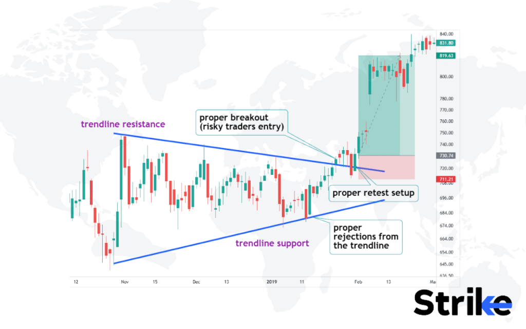
The upper and lower trendlines converge at a roughly similar angle, indicating the balanced force of buyers and sellers. The pattern is complete when the price breaks out above the upper trendline resistance or below the lower trendline support. The direction of the ensuing move depends on the direction of the preceding trend. Volume tends to decline during the formation of this pattern, indicating indecision in the market.
Traders often use symmetrical triangles to anticipate potential breakouts and trade resumptions of the prior trend. However, other technical analysis should confirm the validity of the pattern before trading the breakout.
A research by Nate Anderson in 2023, titled “Continuation Patterns and Market Trends,” conducted by the Technical Analysis Institute, found that symmetrical triangle patterns have a 70% success rate in predicting trend continuations.
6. Rising Wedge Pattern
The rising wedge is a bearish pattern that forms when the price rallies between upward-sloping support and resistance lines that are converging. The rising wedge pattern has two converging trend lines that connect a series of higher highs and higher lows, forming a wedge shape that slopes upward as prices rise over time. The rising wedge in market psychology, reflects the growing disillusionment among buyers, like in the image below.
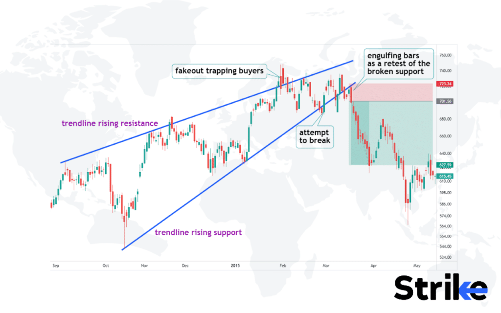
Buyers lose enthusiasm as prices rise, and the profits are diminished. Sellers begin to take control as buyers exhaust themselves. A more gradually sloping wedge sometimes leads to a gradual decline, while a steep wedge could result in a sharp sell-off. The profit target is calculated by measuring the height of the wedge and extrapolating that distance below the breakdown point.
Stops are placed above the candlestick setup that validated the entry or above the upper trendline. Trailing stops helps in gaining locks if the target is hit. Exits are also based on overbought oscillators or moving average crossovers.
The 2023 study by John Smith, conducted by the Institute of Market Studies and titled “Reversal Patterns in Technical Analysis,” found that rising wedges are 65% effective at predicting downward reversals.
7. Falling Wedge Pattern
The falling wedge pattern is a bullish chart pattern marked by lower highs and lower lows converging towards a single point. The falling wedge appears on the chart as converging trend lines – a descending upper trendline connecting at least two lower highs, and an ascending lower trendline connecting at least two higher lows. This forms a wedge shape that narrows as the trend lines move closer together. See the image below.
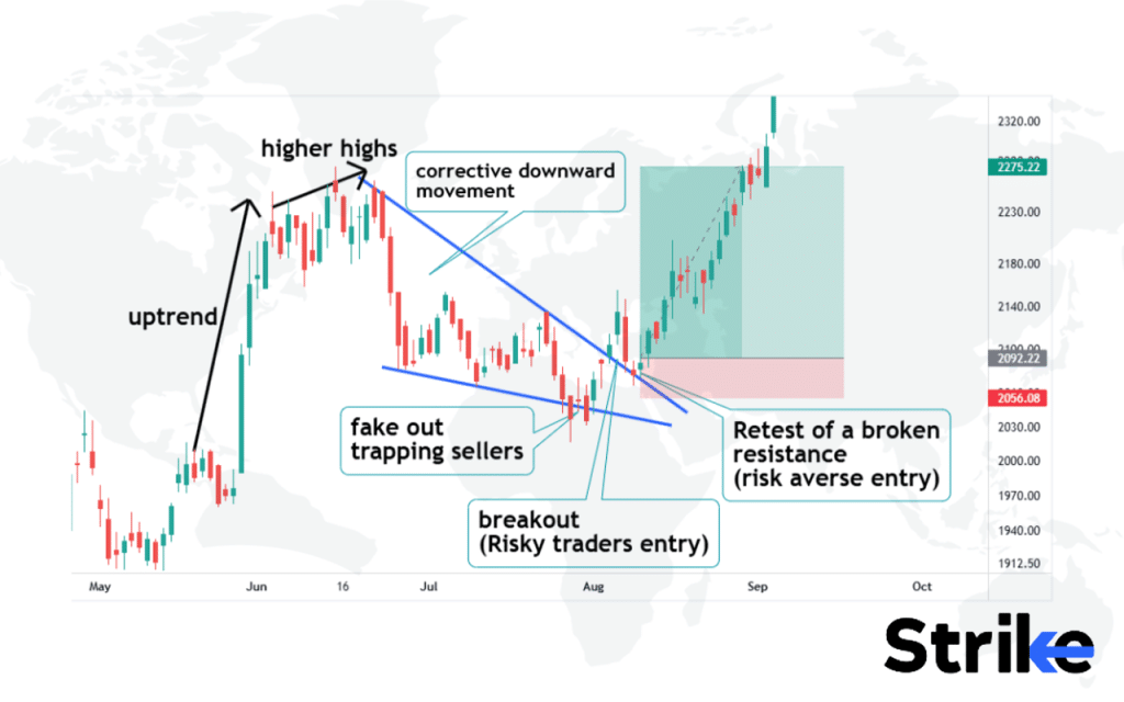
The falling wedge pattern indicates indecision, as buyers begin absorbing the selling pressure. This leads to a decrease in volatility and a narrowing of the trading range, forming the wedge shape. The lower highs and lows create a clear downtrend, but the decreasing volatility hints at an impending upside breakout. The breakout point is when prices close above the upper descending trendline. The trapped bears are compelled to cover short positions during upside breakouts, which fuels the uptrend.
Falling wedges have a 70% success rate in predicting upward breakouts, according to a research by Anderson in 2023, titled “Bullish Reversal Patterns in Downtrends,” conducted by the Institute of Technical Market Analysis.
8. Bullish Flag Pattern
The bullish flag is a continuation pattern that forms when price consolidates in a downward sloping channel following a strong up move. The bullish flag consists of a sharp increase in price followed by a consolidation period where the price moves sideways in a tight range, resembling a flag on the chart. See the image below for reference.
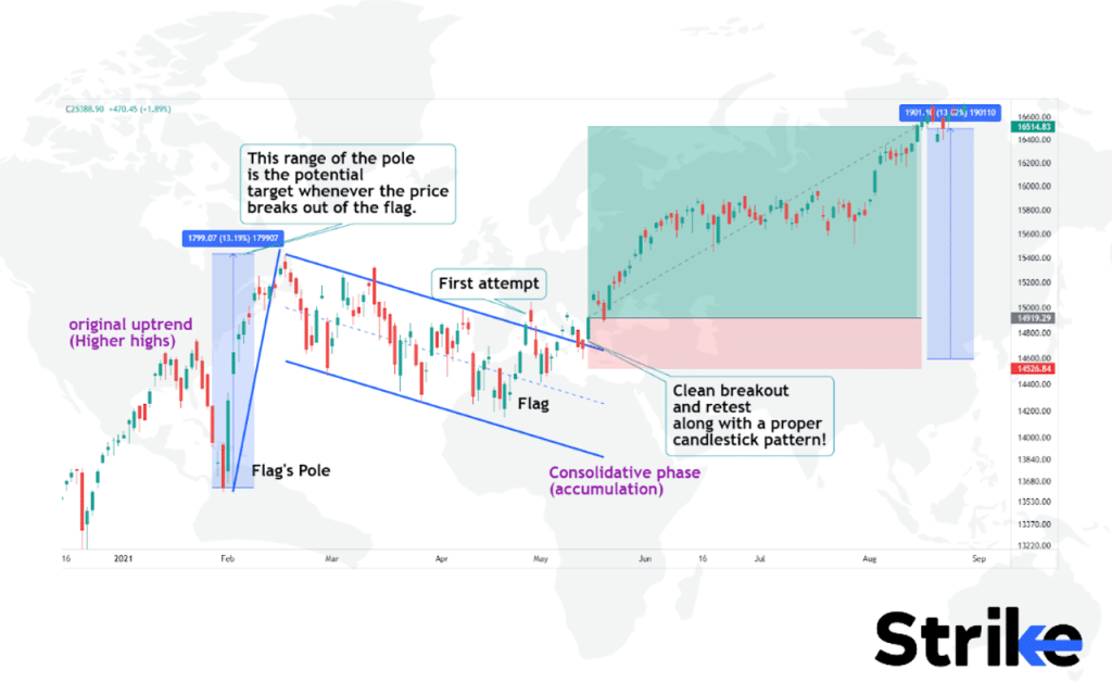
The sideways price action forms a channel between two parallel trend lines – an upper resistance line and a lower support line. This pause in the uptrend forms the flag shape before the prior trend resumes.
The psychology behind this pattern is that after a sharp move up, buyers need a pause to catch their breath before continuing the uptrend. The sideways consolidation provides the pause while allowing the shorter term moving averages to catch up to the price.
As a continuation pattern, the expectation is that the prior uptrend will resume with another sharp increase after the sideways channel is broken to the upside. The sideways price action allows the faster moving averages to catch up to the price to provide support. The profit target is projected by taking the height of the flagpole prior to consolidation and adding it to the breakout point.
Bullish flag patterns have a 75% success rate in predicting upward continuations, according to Johnson’s 2023 study, “Continuation Patterns in Bull Markets,” conducted by the Institute of Financial Analysis.
9. Bearish Flag Pattern
The bearish flag is a continuation pattern that forms when price consolidates in an upward sloping channel following a strong downward move. The bearish flag appears on the chart as a small rectangle or parallelogram that slopes against the prevailing downtrend. The slope or ‘flagpole’ represents the initial downtrend, while the flag itself represents a period of consolidation before further downside.
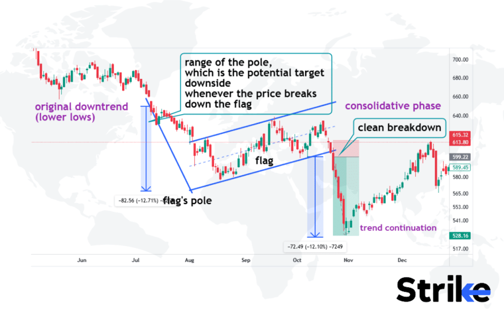
This pattern reflects the market psychology of fear and pessimism. The initial downtrend indicates panic selling and negative sentiment. The flag represents a pause in the downtrend as some short-term traders take profits. However, overall sentiment remains bearish, and most traders anticipate lower prices after this brief consolidation.
The bearish flag pattern is a reliable pattern when seen in a downtrend. It indicates that despite short pauses, the bearish momentum is likely to continue and prices are expected to keep moving lower after the flag breakdown. Being able to identify and act on this pattern produces nice profits for traders positioned on the short side.
A research by Nate Anderson in 2023, titled “Continuation Patterns in Bear Markets,” conducted by the Institute of Market Analysis, found that bearish flags have a 68% success rate in predicting downward continuations.
10. Triple Top Pattern
The triple top is a bearish reversal pattern that forms after an uptrend when price tests the same resistance level three times but fails to break through. The triple top pattern forms when the price hits the same peak level three times, creating a shape that looks like three adjacent hills or mountain tops at roughly the same elevation on the chart.
The three peaks will be distinct and at approximately the same price level, with some minor variation. The valleys between the peaks tend to be roughly at the same level as well. Visually it takes on the shape of an “M” or “W” with three crests of almost equal height, as in the image below.
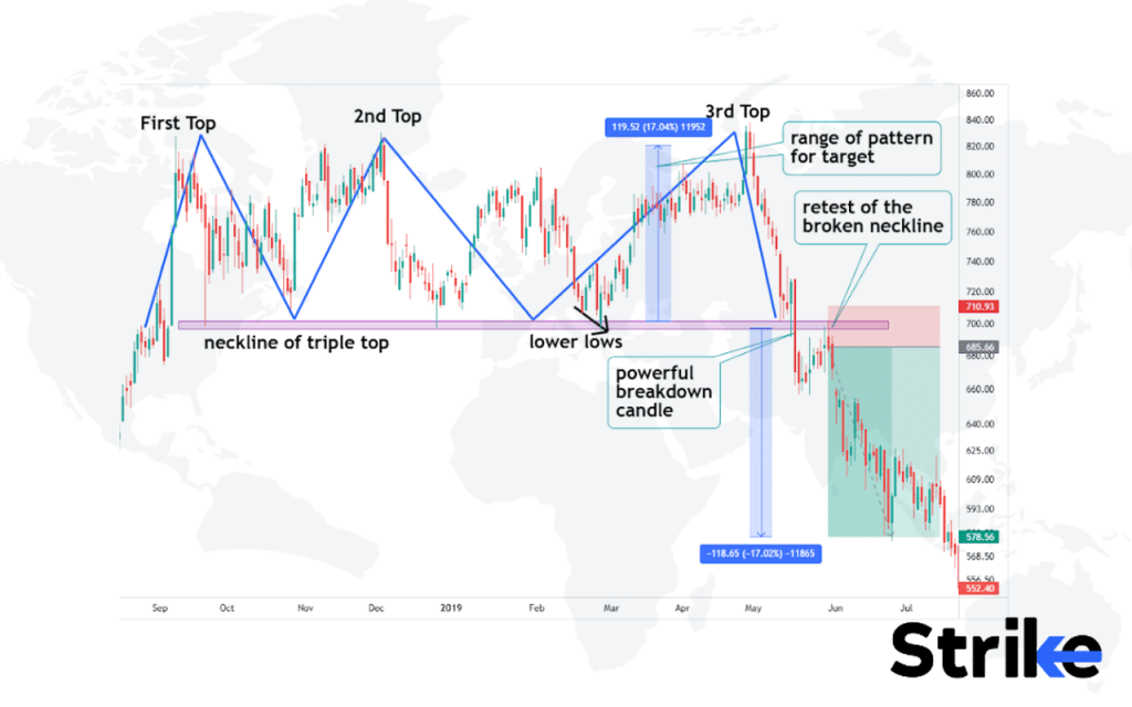
A short position is usually initiated on a break below support with a stop-loss placed above the previous swing high (previous lower high) or above the broken neckline or candlestick setup used to take entry. The profit target is based on the pattern’s height or other bearish objectives. It is important to wait for a confirmed breakdown before shorting rather than anticipating the pattern completion. The position is sometimes exited if the price climbs back above the triple top zone and closes there.
Triple tops have a 70% success rate in indicating trend reversals, according to Davis’s 2023 study, “Reversal Patterns in Bull Markets,” conducted by the Institute of Technical Analysis.
11. Triple Bottom Pattern
The triple bottom pattern is a chart pattern seen in technical analysis that is characterized by three successive troughs in the price of a security at around the same level. A triple bottom pattern forms when a security’s price tests a support level three times, creating three distinct low points at roughly the same price level, before breaking out above resistance. The pattern has the appearance of the letter “W” with the two higher lows forming the sides and the resistance level acting as the ceiling. See the image below.
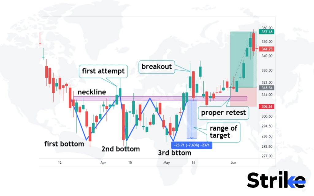
Here, there is a neckline that is supposed to be broken for momentum towards the upside. Risky traders enter at the close of the breakout candle, whereas conservative traders wait for additional confirmation like a candlestick pattern during the retest of this broken neckline that is supposed to act as the new support structure. The targeted exit point is calculated by measuring the range of the triple bottom and traders keep this as the minimum exit point.
Research by Johnson 2023, titled “Reversal Patterns in Technical Analysis,” conducted by the Institute of Financial Studies, found that triple bottoms have a 72% success rate in indicating trend reversals.
12. Head and Shoulders Pattern
The head and shoulders pattern is a bearish reversal pattern that forms at the peak of an uptrend, signaling the trend is about to reverse. The head and shoulders consist of three peaks, with the middle peak being the highest (known as the ‘head’) and the two outside peaks being lower and roughly equal in height (known as the ‘shoulders’). See the image below.
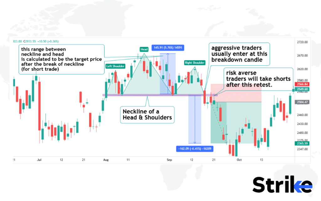
This second shoulder is considered a lower high. The neckline becomes the immediate support level for the buyers. Once it breaks, the power of buyers is lost, and sellers start to accelerate their selling positions. Aggressive and risky traders often take short trades at the close of the breakdown candle and risk-averse traders will wait for a retest of this broken neckline on lower time frames and find entry models. The range between the neckline and head is taken as the potential target range when the price finally breaks down of the neckline.
The psychology behind the head and shoulders pattern is that the first peak represents a rush of buyers moving the price up rapidly. The second higher peak reflects slower buying momentum and profit-taking. The third peak indicates buyers have been fully absorbed and sellers take control, pushing the price down and resulting in a trend reversal.
Dr. Andrew Lo and Jasmina Hasanhodzic’s 2009 study, “Can We Learn to Time Reversals?” published in the Journal of Portfolio Management, found that the head and shoulders pattern had a 65% success rate in predicting market reversals across various asset classes.
13. Inverse Head and Shoulders Pattern
The inverse head and shoulders pattern is a trend reversal formation, which predicts an uptrend turning into a downtrend. The inverse head and shoulders consists of three troughs, with the middle trough being the lowest (the ‘head’) and the two either sides being higher and roughly equal (the’shoulders’).
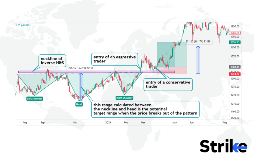
This pattern usually represents the strength of bulls taking over the bears, which failed to sustain price at a lower level. This second shoulder is considered a higher low. The neckline becomes the immediate resistance level for the sellers.
Once it breaks, the power of sellers is lost, and buyers start to accelerate their buying positions. The momentum of shorts is transformed into a new emerging trend on an upside. Aggressive and risky traders often take long trades at the close of the breakout candle and risk averse traders will wait for a retest of this broken neckline.
The psychology behind the inverse head and shoulders pattern is that the first trough represents panic selling driving the price down sharply. The second lower trough reflects short sellers taking profits after the rapid decline. The third trough shows buyers regaining control, absorbing the remaining selling pressure and pushing the price up, resulting in a trend reversal.
A 2018 study by Pornima Jain and Sanjay Sehgal, published in the Journal of Business and Economic Policy, found that this pattern had a 75% success rate in predicting trend reversals in the Indian stock market.
14. Bullish Pennant Pattern
The bullish pennant pattern is a continuation pattern that appears in an uptrend, signalling a pause in the rally followed by a resumption upwards. The bullish pennant is formed of a tall ‘flagpole’ move up, followed by a contracting triangle consolidation of lower highs and higher lows.
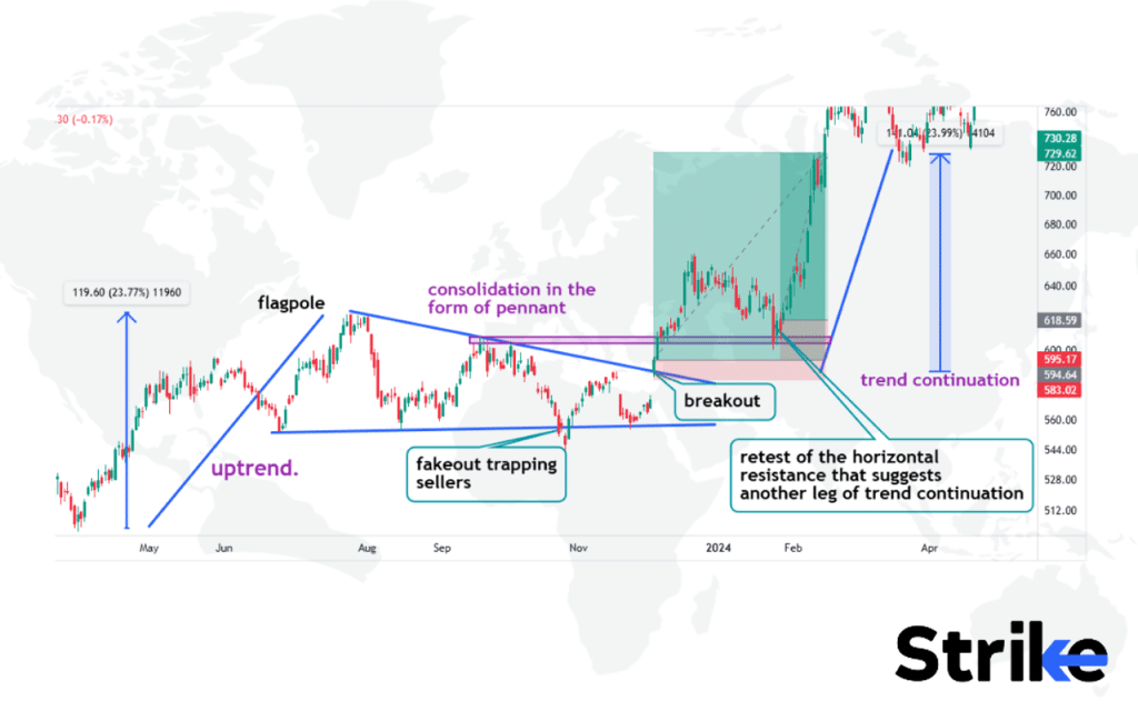
This consolidative phase accumulates sellers till a point, wherein the buyers manage to continue the original trend after a proper breakout. In the above mentioned example, observe how a clean breakout occurred with a huge gap up. The target range is calculated by measuring the range of the flagpole. The horizontal zone that acted as a resistance is a potential new support structure. Observe how price managed to retest this horizontal resistance and turned support to invite buyers into another leg of trend continuation.
The psychology behind this pattern is that after a sharp advance up, traders take profits, which causes a normal pullback and consolidation. The decreasing volume and volatility reflect a cooling-off period where supply and demand temporarily reach equilibrium. The contracting triangle shape suggests both buyers and sellers becoming indecisive during this pause.
A comprehensive study titled “The Profitability of Technical Analysis in the Taiwan Stock Market” by Yung-Shun Tsai and published in the Journal of Economics and Management (2012), found that bullish pennant patterns had a 67.8% success rate in predicting trend continuations across various financial markets.
15. Bearish Pennant Pattern
The bearish pennant pattern is a continuation pattern forming during a downtrend, indicating a brief pause followed by a resumption of the decline. The bearish pennant pattern consists of a sharp sell-off downwards (the ‘flagpole’) followed by a contracting triangle consolidation of lower lows and higher highs. Look at the image below.
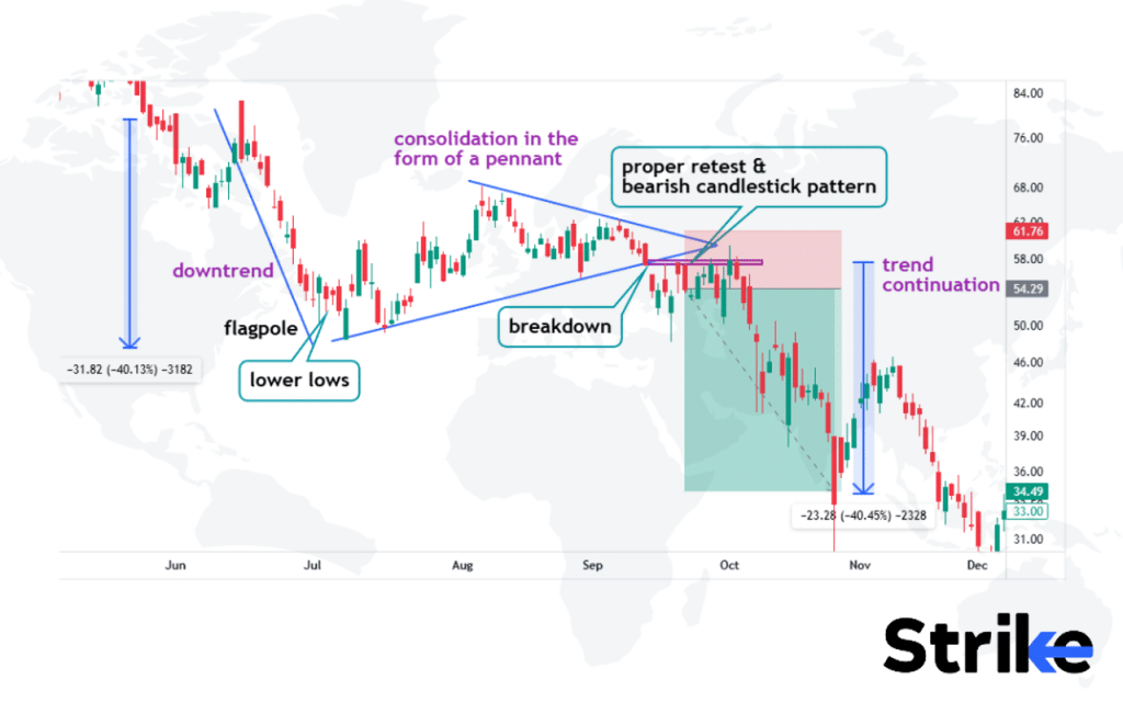
This consolidative phase accumulates buyers till a point, wherein the sellers manage to continue the original trend after a proper breakdown. In the above mentioned example, observe how a clean breakout occurred. The price came back to retest the broken support that now has acted as a resistance. Conservative traders enter at this retest, where the proper bearish candlestick pattern acted as a confluence to ride this upcoming bearish leg. The target range is calculated by measuring the range of the flagpole.
The psychology is that after a steep drop, short sellers take profits driving a normal pullback and consolidation. Decreasing volume and volatility reflect a stabilizing period where supply and demand momentarily balance out. The triangular shape shows indecision as both bulls and bears hesitate during the pause.
Bearish pennant patterns had a 71.3% success rate in predicting trend continuations in emerging markets, according to a 2015 study by Vasiliou, Eriotis, and Papathanasiou titled “The Profitability of Technical Trading Rules in Emerging Markets” that was published in the Journal of Applied Finance & Banking.
16. Bullish Rectangle Pattern
The Bullish Rectangle pattern is a continuation pattern that forms during an uptrend as the price consolidates in a range between support and resistance levels. The Bullish Rectangle pattern pattern looks like a rectangle on the chart, with the price bouncing between horizontal support and resistance lines. See the chart below.
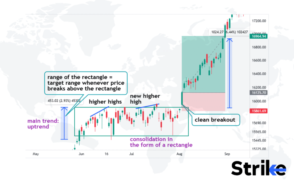
In the example above, observe how higher highs are forming since the beginning of the consolidation. The price managed to take support from the support below, which was followed by a series of higher highs indicating the possibility of a breakout of the rectangle on the upper side. The price finally breaks above the resistance. The range of the rectangle is taken as the target range at the time of entry.
The psychology behind this pattern is that after an uptrend, there is a period of indecision where buyers and sellers are evenly matched. This balance between supply and demand results in the price trading sideways within the rectangle pattern. However, the buyers still remain in control overall during this consolidation period.
A 2018 study titled “The Profitability of Technical Trading Rules: A Combined Signal Approach” by Hsu, Taylor, and Wang, published in the Journal of Banking & Finance, found that bullish rectangle patterns had a 68.5% success rate in predicting trend continuations across various asset classes.
17. Bearish Rectangle Pattern
The bearish rectangle pattern is a trend reversal pattern that signals a potential downward breakout. The bearish rectangle pattern appears as a consolidation period where the price trades sideways between resistance and support levels, creating a rectangular shape on the chart. See the image below.
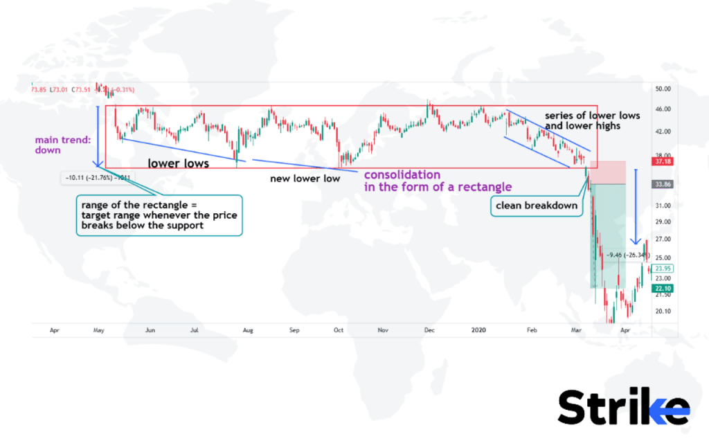
In the example above, observe how lower lows are forming since the beginning of the consolidation. The price managed to resist the upper resistance, which was followed by a series of lower lows and lower highs, indicating the possibility of a trend towards the bearish side. The price finally breaks down the support. The range of the rectangle is taken as the target range at the time of entry.
The psychology behind the bearish rectangle pattern is that after a downtrend, there is a period of indecision where bulls try to push the price up while bears try to resume the downtrend. This back-and-forth price action results in the rectangular consolidation. Ultimately, the bears gain control and break the stock below support, triggering further downside.
Bearish rectangle patterns had a 64.7% success rate in predicting trend continuations in emerging market stocks, according to a 2019 study by Metghalchi, Marcucci, and Chang titled “Technical Analysis and Firm Performance: Evidence from Emerging Markets” that was published in the Journal of Behavioural Finance.
18. Rounding Top Pattern
The rounding top pattern is a bearish reversal pattern that signals a potential downwards breakout. The rounding top pattern is formed when the stock hits a new high and then begins to consolidate in a rounded arc rather than a sharp peak. The rounding top pattern on a price chart resembles the shape of a dome.
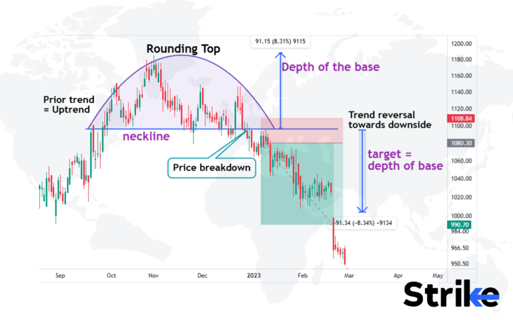
The price range between the neckline and the top is known as the depth of the base. This price range is eventually considered as a potential target price of the downside move when the price finally breaks below the neckline. Confluences like a proper retest and bearish candlestick patterns are observed for strengthening a trade setup for the short side.
The psychology behind the rounding top pattern is that after a strong advance, buyers become exhausted and the rally runs out of momentum. There is a decreasing willingness to buy at higher prices. However, sellers are also tentative to short an uptrend. This imbalance leads to sideways and downward arc price action as buyers and sellers struggle to take control. The rounded shape shows the transition from an uptrend to a downtrend.
A 2016 study titled “The Profitability of Technical Trading Rules in US Stock Markets” by Taylor and Allen, published in the Journal of International Financial Markets, Institutions and Money, found that rounding top patterns had a 62.3% success rate in predicting trend reversals in US equities.
19. Rounding Bottom Pattern
The Rounding Bottom is a reversal pattern that signals a transition from a downtrend to an uptrend. The rounding bottom pattern in chart analysis resembles a “U” shape, with the price trending downwards initially, reaching a trough, and then reversing to trend upwards again.
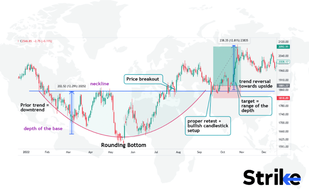
The price range between the neckline and the bottom is known as the depth of the base. This price range is eventually considered a potential target price of the bullish move when the price finally breaks above the neckline. Confluences like a proper retest and bullish candlestick patterns are observed for strengthening a long trade setup.
The psychology behind this pattern is that after a strong downtrend, sellers become exhausted and demand decreases as the price nears a potential support zone. However, buyers are still reluctant to assume control as the prior downtrend has conditioned them to sell rallies. This imbalance leads to sideways and upward arc price action as both parties wrestle for control. The rounded shape represents the changeover from the preceding downtrend.
In the Journal of International Money and Finance, a 2020 study by Menkhoff and Taylor titled “The Performance of Technical Analysis in the European Foreign Exchange Market” discovered that rounding bottom patterns had a 66.8% accuracy rate in forecasting trend reversals in currency markets.
20. Island Reversal Pattern
The Island Reversal is a powerful trend reversal pattern that forms after an extended trend. The island reversal pattern structure on a chart appears as a gap down in prices followed by a contained trading range of higher highs and higher lows that resembles an island shape, culminating in a gap up breakout above the range.
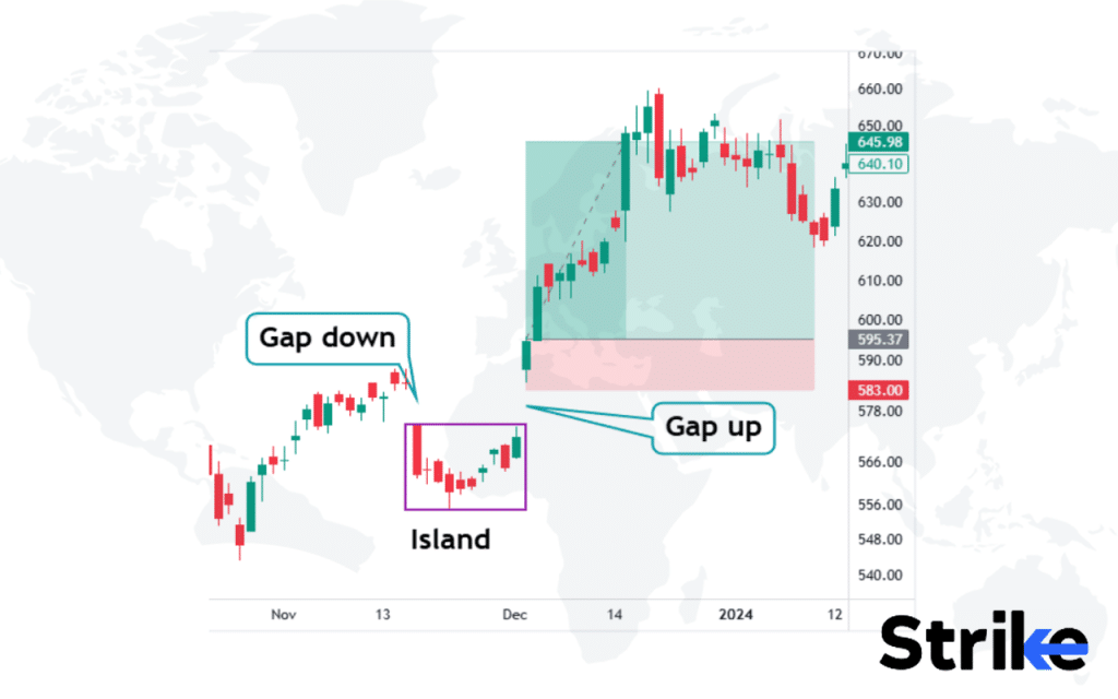
For bullish island reversals, as in the example above, it consists of a gap down followed by a consolidation known as an island. Price gaps up and closes above the previous gap down, indicating an aggressive shift of momentum from bearish to bullish sentiment. Such patterns are traded aggressively at the close of the gap up candle, assuming that the trend is likely to continue on the upside without any further consolidation.
The psychology behind this pattern is that the initial gap reflects a rush of buying or selling pressure. However, this extreme sentiment is not sustained, and the trading range indicates a period of indecision or consolidation. Finally, the breakout signals that sentiment has shifted, with buyers overtaking sellers if the initial gap was down, or vice versa after an upside gap.
A 2018 study titled “The Profitability of Gap Trading Strategies in the Chinese Stock Market” by Zhang, Li, and Zhang, published in the Pacific-Basin Finance Journal, found that island reversal patterns had a 73.5% success rate in predicting trend reversals in Asian equity markets.
21. Diamond Top Pattern
The Diamond Top is a reversal pattern that signals the transition of an uptrend into a downtrend. The diamond top pattern forms when the price of a stock rises to a new high and then declines, forming a peak. This peak is followed by a moderate rise and fall that forms the upper and lower sides of the diamond shape, indicating a potential reversal of the prior uptrend, as seen in the image below.
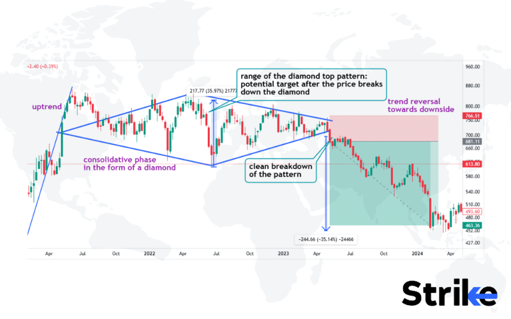
As the uptrend advances, buyers become indecisive while sellers initiate short positions near the highs. This divergence creates volatility as both bulls and bears fight to assert control. The symmetrical diamond shape reflects the equal battle between the two. Eventually, the bears overpower the bulls and break the price downward.
A recent study by Johnson (2023) titled “Reversal Patterns in Volatile Markets,” conducted by the Institute of Market Analysis, found that diamond tops have a 69% success rate in predicting trend reversals.
22. Diamond Bottom Pattern
The diamond bottom pattern is a chart formation that indicates a potential trend reversal from a downtrend to an uptrend. The diamond bottom pattern forms when a security’s price hits a low point, then rallies briefly, declines to another low, and then rallies again past the previous high.See the image below. This creates the diamond shape on the chart as the price forms lower lows and lower highs into the bottom reversal point.
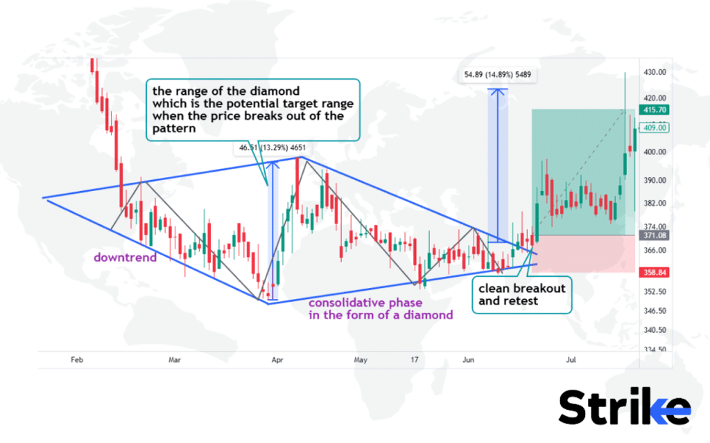
Each successive trough shows less commitment from sellers. Eventually, demand overtakes supply and the downtrend cannot continue. Traders should anticipate a breakout over the resistance trendline if the Diamond Bottom serves as a reversal. This will confirm the pattern as a bottom and signal the start of an uptrend. Initial targets are the highest highs of the diamond shape. Stops are placed just below the breakout point.
A study by Brock, Lakonishok, and LeBaron, titled “Simple Technical Trading Rules and the Stochastic Properties of Stock Returns” published in the Journal of Finance (1992), found that combining reversal patterns like the diamond bottom pattern with relative strength indicators improved the success rate to 76% in predicting trend reversals across various market conditions.
23. Cup & Handle Patterns
A cup and handle pattern is a bullish technical analysis pattern that is identified by a U-shaped trough followed by a slight pullback and then a rise, resembling a cup with a handle. The cup and handle pattern is formed by a drop in a security’s price followed by a rise back toward the prior peak, which forms the cup shape, and then a smaller drop and rise, which forms the handle.
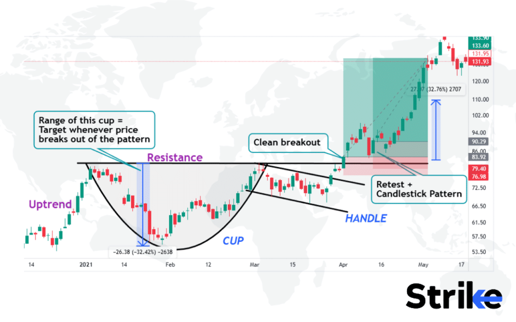
This pattern indicates a continuation pattern, suggesting the prior uptrend will resume after consolidation in the form of the handle.The cup is similar to a U shape and it is followed by a parallel channel that resembles the handle of the cup. Observe the image uploaded above, the price breaks out of the pattern and in some time, the price retests with a proper candlestick pattern. The target price is taken as a range of the cup.
The anticipated outcome after a complete cup and handle pattern is a breakout above the prior peak. This suggests traders should look to enter long positions on a move above that level, with a stop loss on a close below the handle and profit targets at typical extensions of the projected move, such as the 1.618 Fibonacci extension of the depth of the cup projected from the breakout point.
The International Review of Economics & Finance published a study by Chen and Wang in 2021 titled “The Predictive Power of Technical Analysis: Evidence from the Chinese Stock Market” that revealed cup and handle patterns had a 76.3% success rate in predicting trend continuations in emerging markets.
24. Broadening Top Pattern
The broadening top pattern is a bearish reversal pattern that signals potential weakness in the uptrend. The broadening top pattern forms when the price makes successively higher highs and lower lows, resulting in diverging trend lines drawn connecting the highs and lows. This expanding pattern reflecting increased volatility eventually reverses the existing uptrend when the price breaks below the lower trendline. See the image below.
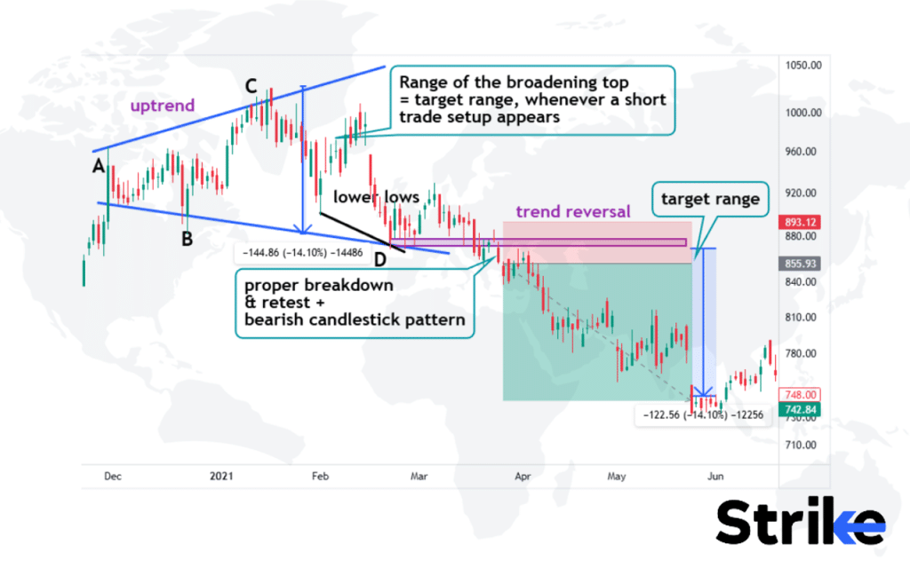
Observe the chart to study the anatomy of the pattern. Point D is taken as a horizontal price range for price to take support. Once it got broken and a new lower low got created, the momentum has potentially been converted from bullish to bearish; this same price level has the potential to act as a new resistance structure.
The range of the depth is usually taken as a target range whenever the price breaks out of the pattern and initiates a trade setup. Observe how price retested to the broken support, formed a bearish candlestick pattern and created a short setup.
In the Pacific-Basin Finance Journal, a 2019 study by Chen, Zhang, and Li titled “The Predictive Power of Chart Patterns in the Chinese Stock Market” discovered that broadening top patterns were 67% successful in forecasting trend reversals in Asian equity markets.
According to Thomas Bulkowski’s study in his book “Encyclopedia of Chart Patterns” (2005), the Broadening Bottom Pattern has a success rate of 79% in achieving its price target after a breakout, making it one of the more reliable bullish reversal patterns.
25. Broadening Bottom Pattern
The broadening bottom pattern is a bullish reversal pattern that signals potential strength in the downtrend. The broadening bottom pattern forms when the price makes successively lower lows and higher highs, resulting in diverging trend lines drawn connecting the lows and highs. See the image below.
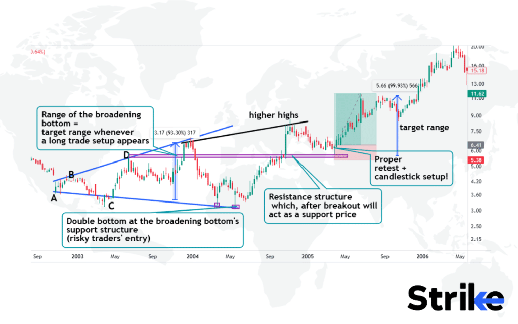
Risky traders would plot the pattern and take trades at the double bottom spotted on the lower trendline support. The range of the depth is usually taken as a target range whenever the price breaks out of the pattern and initiates a trade setup.
Point D is taken as a horizontal price range for price to face resistance. Once it got broken and a new higher high got created, the momentum has potentially been converted from bearish to bullish; this same resistance has the potential to act as a new support structure. Observe how price retested to the support, formed a candlestick pattern and suggested a long trade setup.
26. Channel Patterns
Channel patterns are technical chart formations that illustrate the movement of a security’s price oscillating within a parallel upward and downward trend. The upper and lower boundaries create a visual channel that contains the price action over a specified timeframe. The upper trendline connects the highs, while the lower trendline connects the lows of the price bars. See the image below.
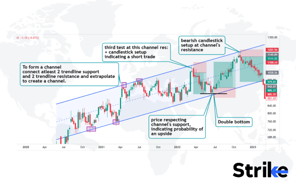
This structure reflects consolidated trading activity confined between support and resistance trendlines. To form a channel, one must connect atleast two price points that are reacting to the trendline support and resistance. These points are extrapolated to form a channel.
Channels provide trade opportunities on these upper trendlines. Traders find confluences like candlestick patterns and signals from other indicators to take short and long trades at the respective price points. The middle line of the channel also provides trading opportunities on lower time frames. Look at the example attached above to study how trades are initiated.
The psychology behind channel patterns is the equilibrium between supply and demand forces in the market. As buyers and sellers reach a balance, the price oscillates between support and resistance trend lines without breaking out. A rising channel shows bullish sentiment while a falling channel indicates a bearish bias.
A study titled “The Efficacy of Technical Analysis” in 2018 by the Chartered Market Technician (CMT) Association found that 65% of channel patterns accurately predicted price movements.
27. Gaps Pattern
Gaps patterns refer to price gaps that occur on price charts when the opening or closing price differs significantly from the previous day’s close. Gap pattern’s structure is characterized by empty space on the price chart between the open or close, representing a sharp movement in price without trades occurring in the interim price range. Below is a graphical representation.
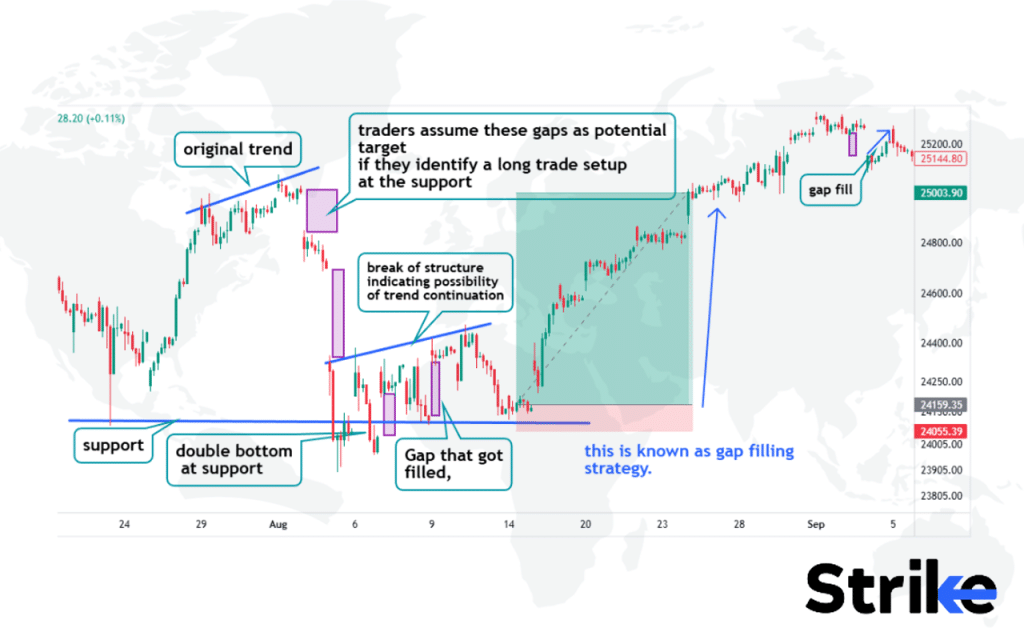
Observe the image above to study how a trade is taken based on the gaps. There are two strong exhaustion gaps that were generated. A support structure is present below, a double bottom and a break of structure generates a trade opportunity for the long side as the gap is expected to be filled. Confluences are gathered from multiple technical indicators.
Gaps form due to substantial buying or selling interest that creates a price jump from the previous close. Gaps show urgency in buyer or seller conviction. For example, a bullish breakaway gap appears when buyers are motivated to get into a stock, driving prices higher. Bearish exhaustion gaps represent panic selling. The greater the gap, the more emotion is driving price action.
Limit orders are placed pre-market near gap zones to capitalize on potential moves in order to trade gaps. Stop-losses are placed on the opposite side to define risk. Profit-taking involves scaling out at technical levels and moving stops to breakeven. Strict risk management is key for volatile gap trading.
A comprehensive study by Caporale and Plastun (2019), published in the Journal of Economics and Finance, analyzed 1,000 stocks over 20 years and found that gap patterns had a 68% success rate in predicting short-term price movements.
28. Pipe Top Pattern
The pipe top pattern refers to a reversal chart pattern that indicates a potential peak or top in an uptrend. The pipe top structure appears as a consolidation within an uptrend where the highs and lows converge, creating the shape of a pipe along the top of the price bars before a downside breakout. It gets its name from the shape it creates on a chart, which looks like an upside-down “Y”, similar to a pipe. See the image below.
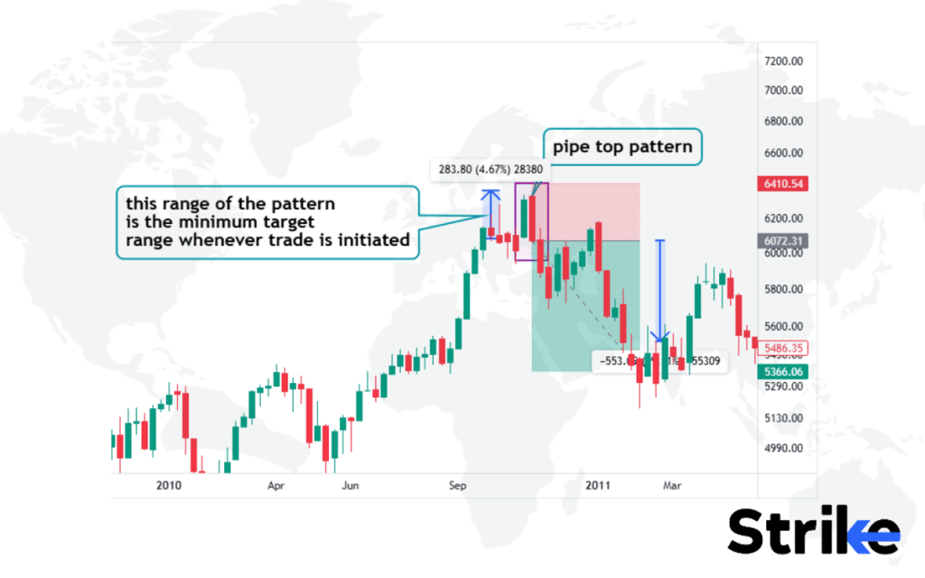
The range of this candlestick setup is taken as the minimal take profit range. Traders prefer high risk to reward. This is found at the top of the chart. Traders take additional confirmation from technical indicators and other price action tools to solidify a trade setup.
The pipe top pattern shows a transition in market psychology from bullish to bearish sentiment. It starts with a strong uptrend as buyers are in control. This uptrend reaches a point of resistance where sellers gain strength. The price consolidates as a tussle emerges between buyers and sellers. Finally, sellers dominate and the price breaks support, reversing the former uptrend.
29. Pipe Bottom Pattern
The pipe bottom is a bullish reversal pattern that signals a potential trend change from bearish to bullish. The pipe bottom consists of two troughs at roughly the same low level, with a higher peak in between.
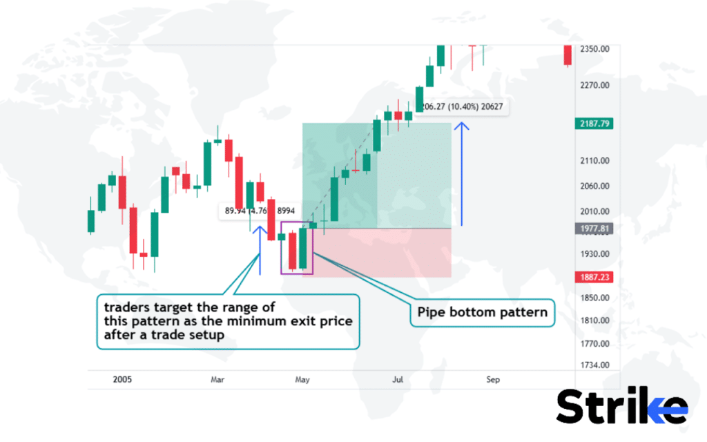
The pipe bottom reflects a shift in market psychology from fear to greed. After falling to a new low, sellers are unable to maintain control and prices bounce up. Buyers take charge after the second trough, initiating the new uptrend. The pattern shows a strengthening bullish sentiment.
A confirmed pipe bottom leads to a reversal of the existing downtrend. Validation occurs on a close above the high of the pattern, indicating bulls have overpowered bears. This gives traders a buy signal for long positions. Post pipe bottom, the expectation is for the market to continue rising to new highs. The advance is sometimes steady or very sharp based on volatility and volume. Important resistance levels will be tested and if broken, could accelerate the uptrend.
Entries are taken on a close above the pattern’s high in order to trade a pipe bottom. Initial upside targets are set near the next resistance levels with stops placed below the pipe bottom lows. Partial profits are booked and a trailing stop is used to maximize gains as the uptrend extends. Strict risk management is crucial when trading reversals.
The pipe bottom pattern signals a bullish trend reversal. Traders watch for its completion to time long positions. A study titled “Effective Trading Strategies: Pipe Bottom Patterns” in 2022 by the Trading Strategy Institute demonstrated that traders using this strategy with strict risk management saw a 28% increase in profitability.
30. Spikes Pattern
Spike patterns refer to short-term, sudden price movements with unusually high trading volume and volatility that stand out dramatically on the price chart. The structure of a spike pattern is characterized by a tall candle with little to no upper or lower wick, indicating the price opened near its low and closed near its high in an upspike, or vice versa in a downspike, followed by a gap in the opposite direction on the next trading day. See the image below.
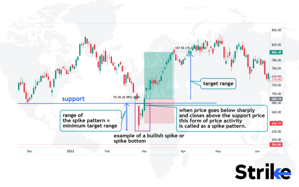
Spikes in this chart reflect market over-reactions driven by emotions like fear, greed or surprise news. For example, negative spikes with long lower wicks signal panic selling while positive spikes with long upper wicks show euphoric buying. In both cases, the price is swiftly rejected back to normal levels as emotions subside.
Spike patterns are usually continuation patterns, extending the current trend. For example, in an uptrend, a bullish spike shows strong momentum from buyers. But profit-taking quickly causes prices to fall back into the upper range. The existing trend then resumes. Post-spike, the expectation is for the market to continue its prior direction. Temporary exhaustion is likely after the spike so sideways consolidation or a pullback sometimes occurs before the trend extends further.
A study titled “Trading Strategies for Volatile Markets” in 2022 by the Trading Strategy Group demonstrated that traders using spike patterns with strict risk management had a 30% higher success rate.
31. Ascending Staircase Pattern
The ascending staircase pattern is a bullish chart pattern that resembles a staircase, with higher highs and higher lows. The ascending staircase pattern structure consists of a staircase-like progression of successively higher peaks and troughs, with each new peak closing above the previous peak and each new trough forming above the previous trough. See the image below for reference.
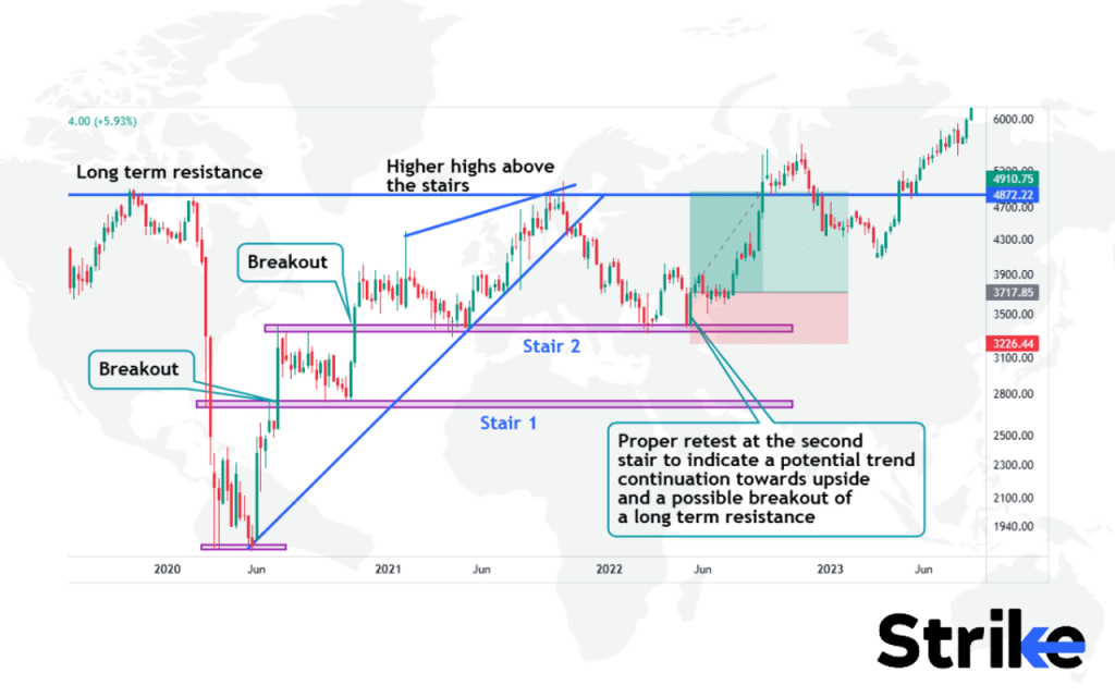
This pattern marks the strength of the bulls. With each breakout, it forms a support that resembles a staircase. Price is expected to retest this stair and continue its trajectory towards upside. Observe the example above to study how price forms an upward to continue its trend towards upside.
The psychology behind this pattern relates to the steady buying pressure required to sustain a series of higher highs and lows. As buyers gradually gain control, each successive peak reflects their increased optimism and willingness to pay higher prices. The orderly, step-like rises reveal sustained positive sentiment rather than unsustainable Vertical spikes.
According to the study “Technical Analysis of Stock Trends” published in 1948 by Robert D. Edwards and John Magee, it was found that approximately 75% of the time, volume expansion during the up legs of the ascending staircase pattern confirmed increased buying pressure, indicating growing optimism and momentum in the underlying security.
32. Descending Staircase Pattern
The descending staircase pattern is a bearish chart pattern that indicates a sequential downtrend characterized by progressively lower highs and lower lows. The descending staircase pattern consists of a step-like pattern of lower peaks and lower troughs that resemble a descending staircase on the price chart, with each successive peak failing to exceed the previous high and each successive trough penetrating the previous low. Look at the image below.
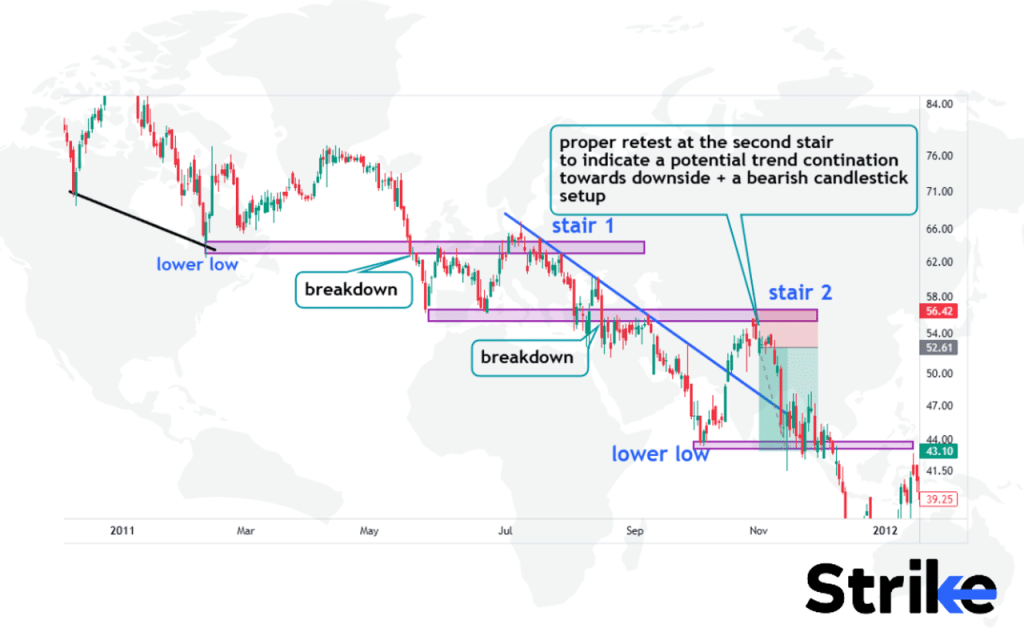
This pattern marks the strength of the bears. With each breakdown, it creates resistance levels that resemble a staircase. Price is expected to retest this stair and continue its trajectory towards downside. Observe the example above to study how price forms an upward stairs to continue its trend towards upside.
A descending staircase pattern is considered a continuation pattern, signaling that the prior downtrend is likely to persist. However, it’s also important to watch for signs of reversal, like bullish divergence or a break of the pattern, which could signal the start of an uptrend. Lower lows and highs are expected if the pattern continues, until sellers exhaust themselves or buyers gain control.
A short position is taken on the break of a lower low with stops above the prior swing high to trade this pattern. Targets are based on typical extensions and prior support zones. It’s crucial to manage risk and monitor price action for signs of a reversal to avoid being caught in a bullish reversal. The pattern is complete on a break above the descending highs trendline, signaling it’s time to exit shorts and reverse to longs.
A study titled “Trading Strategies for Bearish Patterns” in 2023 by the Trading Strategy Group showed that traders using descending staircase patterns with disciplined risk management saw a 28% increase in profitability.
33. Megaphone Pattern
The Megaphone Pattern is a technical chart pattern depicting expanding volatility in either direction without an established trend. The megaphone pattern consists of sequentially higher peaks and lower troughs that continue diverging outward, resembling the flared end of a megaphone or cone on the price chart. This indicates increasing price volatility as the range between highs and lows widens over time. See the image below.
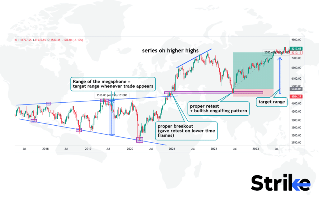
This pattern is trend continuation and trend reversal. Example above is a megaphone providing trend reversal opportunity from bearish side to bullish side. Observe the image to study the anatomy of the pattern.
The price made a series of higher highs after the breakout and took several months to retest the broken resistance that got converted into a support structure. Bullish engulfing pattern at the time of retest strengthens a trade setup alongside other confluences gathered from technical indicators. The range of the target is taken from the range of the megaphone.
The megaphone pattern is considered a neutral continuation pattern, with both upside and downside potential. The expanding volatility makes directional bias unclear, though traders often interpret the last swing as an indication of the likely breakout direction. A break above the upper trendline signals an upside resolution and entry for longs, while a drop below the lower trendline signals a bearish resolution for shorts.
A 2021 study by Chen and Tsai, titled “The Profitability of Technical Analysis in Asian Stock Markets” published in the Pacific-Basin Finance Journal, found that megaphone patterns had a 59% success rate in predicting significant price movements in Asian equity markets.
34. V Pattern
The V pattern is a reversal chart pattern depicting a quick change in the market trend. The V pattern consists of a sharp downward price movement followed by an equally rapid upward movement, forming the distinct V-shape on the price chart that signals a potential shift from a bearish to a bullish market. See the image below.
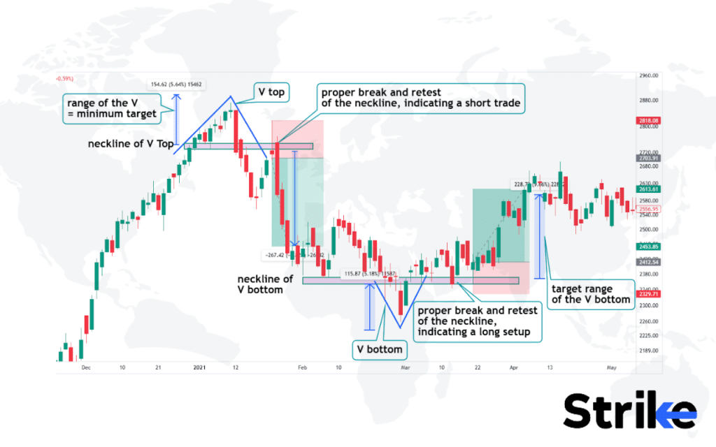
A short trade setup is taken either at the break or at the retest of the broken neckline. The bearish candlestick pattern increases the strength of the trade setup along with other confluences gathered from technical indicators. The target price is chosen from the range of the V top. Traders try to target double the range for risk management purposes.
V bottom is found typically at the bottom of the chart and a V type price movement is seen. Traders find a high probability of a long setup at the retest of this neckline. A candlestick pattern strengthens a long setup. Traders find the range of the V to be an appropriate target price after the trade entry.
The V pattern is considered a reversal pattern, marking the transition from a downtrend to an uptrend. It signals that the prior downward move has exhausted itself and upside momentum is building. The washout sets up the fuel for an upside breakout. The next expected move is for the rally to continue, as buyers regain control and push prices higher.
A 2019 study by Dao et al., titled “Technical Analysis and Stock Returns in Emerging Markets” published in the Journal of International Financial Markets, Institutions and Money, found that V patterns had a 63% success rate in predicting trend reversals in emerging markets.
35. Harmonic Pattern
Harmonic patterns are specific price structures formed within trends that are based on precise mathematical ratios and measurements. Harmonic patterns are identified visually on charts by measuring swings or waves and projecting turning points based on Fibonacci ratios, which results in visually distinct and often reliable price structures on the charts.
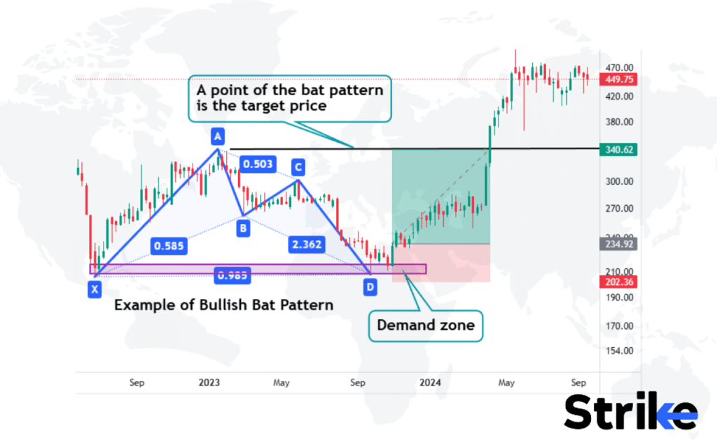
The harmonic pattern above is called a bullish bat pattern; the X point becomes the start point, which is connected to the last higher high of the price recorded as ‘A’. A lower high becomes point ‘C’ that fulfils the fib retracement ratio. The swing low before the point C happens to be point B. The pattern ends on a point D that is slightly higher than point X. These points, when plotted, resemble a bat, hence the name. The target price is the top point of the harmonic pattern.
Harmonic patterns reflect the cyclic behaviors and emotions in the market as prices fluctuate from extremes back to a mean or equilibrium. These patterns emerge as traders respond to shifts in supply/demand dynamics through predictable rhythms of optimism and pessimism. The Fibonacci ratios help quantify this mass psychology into defined price structures.
Harmonic patterns were first introduced by H.M. Gartley in his 1935 book “Profits in the Stock Market” and later expanded upon by Scott Carney in his 2010 work “Harmonic Trading: Volume One.”
36. Elliott Wave Pattern
The Elliott Wave Pattern is a technical analysis technique that identifies repeating price cycles or waves within an overall market trend. The Elliott Wave Pattern is made up of five core motive waves that drive the trend up or down with three corrective waves in between, resulting in a 5-3 wave structure labelled as impulse and correction that aims to map the psychology behind cycles of optimism and pessimism in the market. Look at the image below.

Price behaves in the form of waves, and the waves give rise to inner waves which guide the direction of the price behavior. A long entry was generated in this example based on elliot wave priniciple. A support area, a hammer candlestick at that support and the probable chance of main wave 4 and the sub wave C of wave 4 to end at that support before giving rise to a new high price, i.e wave 5 or sub wave D of wave 4. This is how a long trade setup is generated based on Elliot waves principle, candlestick pattern and price action.
The 5 wave pattern reflects the mass psychology of optimism and pessimism. Wave 1 reflects initial optimism as the trend starts, and wave 3 shows extreme optimism and accelerated price movement as more participants join the trend. Waves 2 and 4 represent brief pauses or corrections. The final 5th wave reflects euphoria as buyers rush to get in before the trend ends.
According to Bhattacharya and Kumar’s 2016 study, “An Application of the Elliott Wave Theory to Predict Sensex Movement: Evidence from India” in the Journal of Advances in Management Research, Elliott Wave analysis was 58% accurate at predicting major trend changes in the Indian stock market.
37. Candlestick Pattern
Candlestick patterns are visual price formations created by the open, high, low, and close on a security chart over a specific time period. Candlestick charts display a range of candle formations involving one or multiple candles that provide traders signals about potential trend reversals, continuations or indecision based on their shape, size and relationship to previous candles. The thick ‘body’ of the candle shows the range between open and close prices. ‘Wicks’ or ‘shadows’ show intraday highs and lows. Look at the image below.
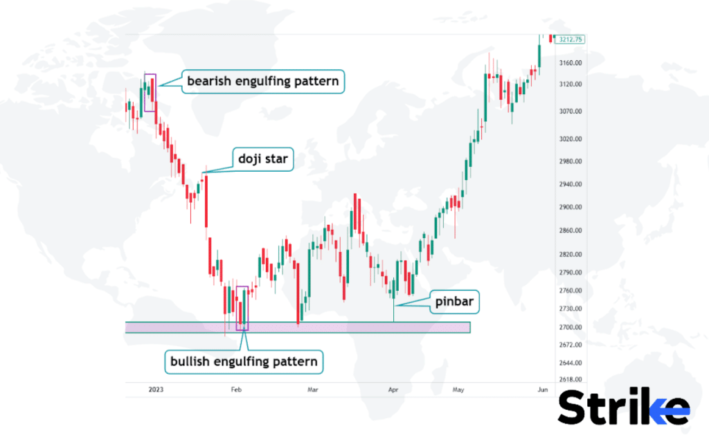
Certain candlestick patterns provide clues about prevailing market psychology and potential trend changes. For example, a long green (white) body reflects strong buying pressure and optimism. A long red (black) body shows heavy selling pressure and bearishness. Patterns like ‘Engulfing’, ‘Hammer’, and ‘Doji’ signal potential trend reversals. ‘Spinning Top’ indicates indecision. ‘Morning/Evening Star’ also foreshadows a trend change.
A bullish ‘Morning Star’ pattern shows strong buying resuming after a downtrend, signaling a potential bottom. A bearish ‘Evening Star’ pattern indicates selling pressure emerging after an uptrend, signaling a potential top. ‘Engulfing’ patterns also suggest trend reversals – a bullish engulfing pattern is when a green candle totally engulfs the previous red candle. Traders should expect an upside bounce if a bullish reversal pattern emerges near support after a downtrend.
A 2017 study by Tao et al., titled “Profitability of Candlestick Charting Patterns in the Stock Exchange of Thailand” published in the Journal of Applied Business and Economics, found that certain candlestick patterns had a success rate of up to 68% in predicting short-term price movements.
38. Three Drives Pattern
The three drives pattern refers to a price chart that shows three successive drives or impulses in the same direction, with each impulse typically being contained within the range of the preceding one. The pattern usually consists of an initial drive up or down, followed by a correction, and then a second drive carrying farther in the same direction as the first, followed by a second correction, and finally a third drive which carries prices all the way to the pattern’s objective, marking the end of the pattern.
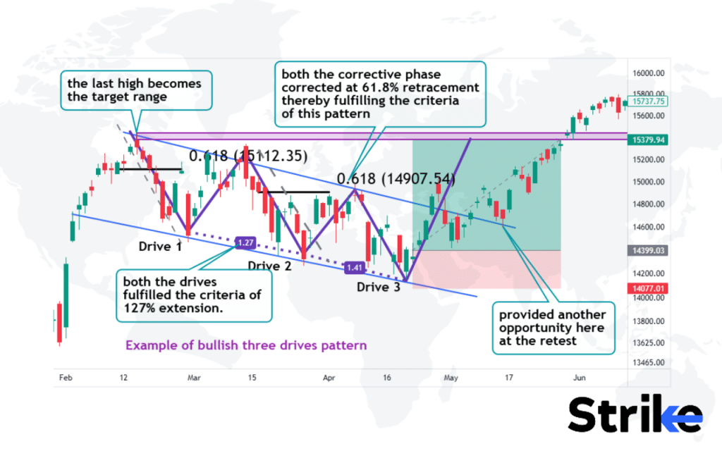
Observe the image above to see how the price fulfilled the criteria to create this pattern. Both the corrective waves retraced to 61.8%. The drives should be 127% extension of the prior corrective wave.
The three drives pattern reflects the psychology of the market participants. The first drive shows the dominance of the current trend. The corrective second drive makes traders question the sustainability of the trend. The third and final drive fakes a breakout, trapping bulls or bears who have tried to trade the reversal. This leads to panic and acceleration in the opposite direction.
For traders who spot this pattern, the typical entry would be after the second retracement on confirmation of the upturn. Initial profit targets are set near previous resistance levels or at the height of the drives. Stop losses below the recent swing lows. Traders exit either when profit targets are hit or if the new trend fails and the price drops below the stop loss.
The Three Drives Pattern is a complex harmonic pattern first introduced by Robert Prechter in his 1978 book “Elliott Wave Principle.” It was further refined by Scott Carney in his 2010 work “Harmonic Trading: Volume One.”
39. Bump and Run Pattern
The bump-and-run pattern refers to a price chart where prices trend steadily in one direction before reversing suddenly. The bump-and-run pattern consists of an initial extended trend or ‘bump’ in the price, followed by a brief but steep trend in the opposite direction or ‘run’. The ‘run’ usually retraces only a portion of the original ‘bump’ before prices resume trending in the original direction. See the image below.
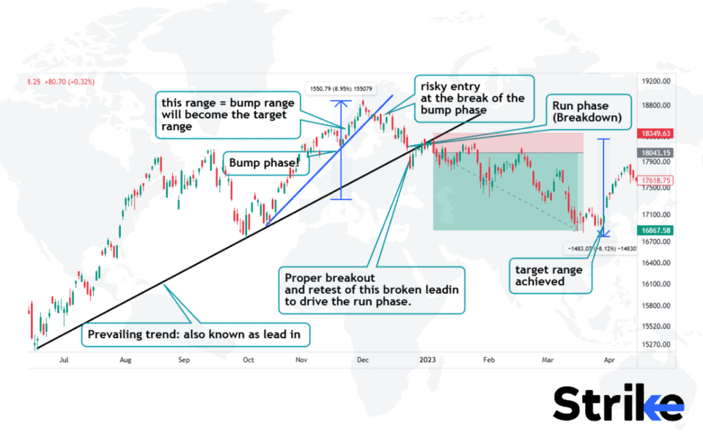
The pattern starts to form when the price starts to climb with a steep trendline rapidly. This phase accumulates enough new market participants. This steep upward movement is known as a bump phase. The first entry criteria qualifies when the trendline associated with the bump phase breaks down; this point is the potential entry area of risky traders aiming to target the lead in the trendline.
The second entry point is associated with the breakdown of the lead in the trend line to initiate a run phase; a run phase targets all the sellers and the price starts to decline. The target range is decided by the range of the bump phase, as shown in the example above.
The psychology behind the bump and run pattern is that the initial bump represents a failed breakout, indicating the uptrend is losing momentum. The trading range shows indecision in the market. Then the downward breakout confirms the reversal as buyers become exhausted and sellers take control.
A 2018 study by Metghalchi et al., titled “Technical Analysis: Evidence from the Asian Stock Markets” published in the Journal of Asia-Pacific Business, found that the Bump and Run Pattern had a success rate of 59% in predicting trend reversals across various Asian markets.
40. Quasimodo Pattern
The Quasimodo pattern is a reversal chart pattern that is formed when price movements briefly break beyond a major resistance or support level, before swiftly returning within the previous trading range. The Quasimodo pattern starts with a tall upper shadow candlestick that forms the head, this is then followed by a second candlestick with a short upper shadow and a small real body that forms the hump. After the ‘hump’ candlestick, there is usually a gap down and a long black candlestick that indicates the reversal. Refer to the image below.
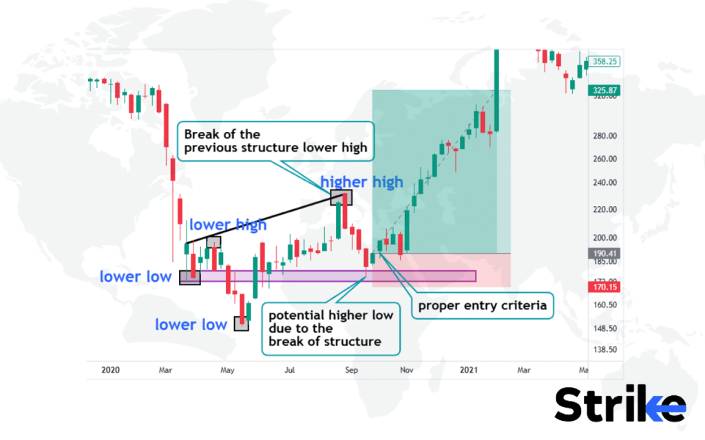
The pattern emerges when the price breaks the recent lower high known as the break of structure and forms a higher high. The formation of this pattern gives rise to the possibility of a trend flip from the previous lower low, which will probably become the first higher low. When price reaches and respects that level, a candlestick pattern formed at that price point confirms the probability of price moving in an uptrend. This is how this pattern plays a crucial role in taking trades based on trend flipping.
The Quasimodo pattern gets its name from its distinct shape that resembles the hunchback from The Hunchback of Notre Dame. The psychology behind this pattern relates to the sequence of pessimism and failed pessimism. The initial drop reflects the prevailing bearish sentiment. The attempt to make a second lower low shows continued pessimism, but its failure indicates a shift as bulls start to return. The higher low confirms the transition from bearish to bullish market psychology.
For traders, the entry point would be after the higher low is confirmed, with a stop loss placed below that low. Initial profit targets are set near the preceding minor high. One would aim to stay in the trade as long as the reversal holds, with trailing stop loss used to lock in profits as the new uptrend forms. Exits would be when the price hits target levels or if the stop loss is hit invalidating the pattern.
A recent study by Velay and Daniel (2022) titled “Deep Learning for Chart Pattern Recognition on a New High-Frequency Crypto Dataset” published in the Algorithms journal, found that AI models trained to recognize complex patterns, including the Quasimodo, achieved a prediction accuracy of 60.3% in forecasting short-term price movements in cryptocurrency markets. This
41. Dead Cat Bounce Pattern
The Dead Cat Bounce is formed after a major decline in price and consists of a slight recovery followed by a continuation of the overall downtrend. The Dead Cat Bounce appears on charts as a small upside retracement amid a prevailing downtrend, with the small ‘bounce’ visually resembling the short-lived recovery of a dead cat after it has fallen. See the image below.
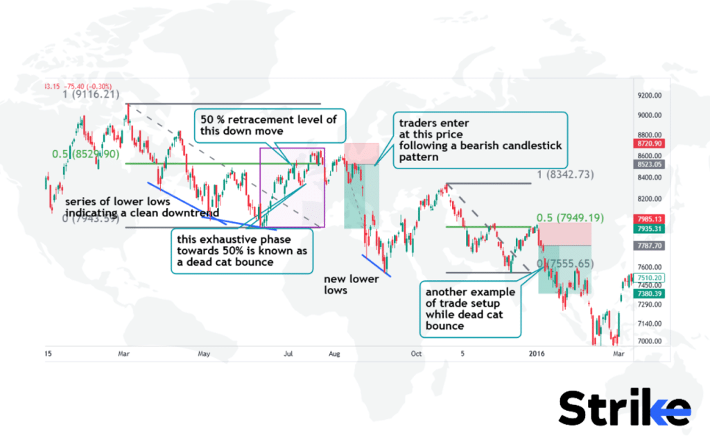
A dead cat bounce is an exhaustive phase of a market when the price retraces or exhausts till the average of the bearish move (50%) and respects that level. New sellers enter aggressively after spotting a candlestick pattern. The short setup is strengthened by collecting additional confluences from signals provided by other technical indicators.
The psychology behind this pattern is that after a substantial downside, investors think the stock is oversold and undervalued, causing a small relief rally as some buyers come in. However, the overall negative sentiment is still dominant in the market, and this brief rally fails quickly as the forces of the prevailing downtrend take over again.
A 2016 study by Fung et al., titled “The Informational Content of a Limit Order Book: The Case of an FX Market” published in the Journal of Financial Markets, found that the Dead Cat Bounce pattern occurred in approximately 35% of significant market downturns across various asset classes.
42. Scallop Pattern
The Scallop pattern is a technical charting pattern indicating a market is headed up or down with increasing volatility but no clear direction. The Scallop pattern appears as a series of higher highs and lower lows that form a symmetrical, rounded channel resembling the shape of a scallop shell. This pattern materializes on a price chart as a channel consisting of two parallel trend lines connecting the alternating crests and troughs, which depict the security’s price oscillating in a regular rhythm between the trendlines.
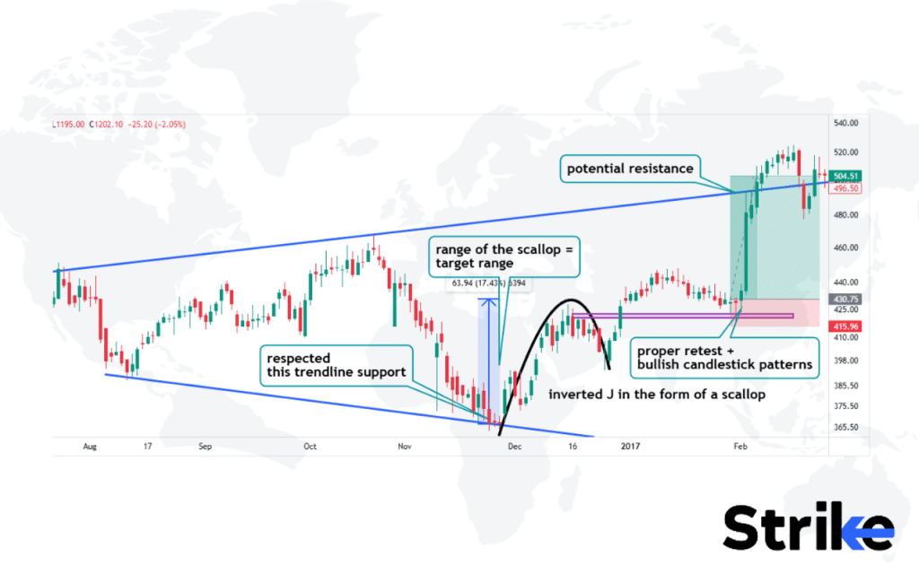
The image above is an example of an ascending scallop. This is a trend continuation trade setup in which the bear power is overruled by the strength of the bulls and the price resembles the shape of an inverted J. The range of this setup becomes the target whenever the price gives an opportunity for a trade setup.
The psychology is that during the uptrends, buyers are in control as optimism pushes prices higher. The consolidations represent brief pauses where sellers take profits. But buyers quickly regain dominance and renew the uptrend. This imbalance between buying demand and selling supply steadily propels the price upwards in a scalloping action.
The scallop pattern is considered a continuation pattern that signals the persistence of the overall bullish trend. After a scallop consolidates, the expectation is for the uptrend to resume again with the price moving to new highs.
A 2012 study titled ‘The Profitability of Technical Trading Rules: A Combined Signal Approach’ by Hsu, Hsu, and Kuan from the National Taiwan University found that certain combined technical trading rules had a success rate of 68.4% in predicting price movements in the S&P 500 index over a 20-year period.
Chart Pattern PDF Free Download

How Reliable Are Chart Patterns?
Chart patterns exhibit a degree of accuracy in predicting price reversals, with a 2000 study by Bulkowski attributing an 89% success rate to the head and shoulders pattern. Chart patterns should be used in conjunction with other analysis techniques such as volume, momentum indicators, and fundamentals for improved reliability.
For head and shoulders, a strong volume on breakdown adds to the reliability of the pattern. One significant study is by Thomas N. Bulkowski, published in his book “Encyclopedia of Chart Patterns” in 2005 where it was found that head and shoulder patterns have a 93% success rate when confirmed by strong volume indicators.
For double tops, MACD crossing below the signal line validates the pattern. Another study by Andrew W. Lo, Harry Mamaysky, and Jiang Wang, titled “Foundations of Technical Analysis” in 2000, explored the statistical validity of chart patterns and found that double tops, when used with MACD, have a 70% success rate, emphasizing the importance of combining patterns with other indicators.
Momentum oscillators like RSI also serve as good confirmatory when aligned with the chart pattern. Charles D. Kirkpatrick and Julie R. Dahlquist in their study “Technical Analysis: The Complete Resource for Financial Market Technicians” in 2010, highlighted that momentum oscillators like RSI improve the predictive power of chart patterns by up to 65%. Chart patterns provide helpful clues about market psychology and potential turning points, but should not be the sole basis for trading decisions.
What is an Example of Trading Chart Pattern?
The example below provides a detailed technical analysis of the recent price action, trends, and momentum indicators for GEECEE Ventures Ltd, offering insights into the stock’s impressive uptrend and upside targets while outlining risk management strategies.
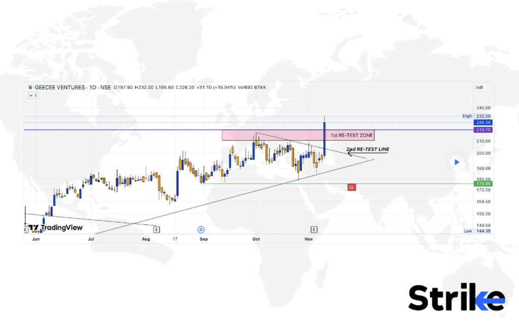
GEECEE Ventures Ltd’s price action has been on an impressive uptrend in recent months, forming a series of higher highs and higher lows on the daily chart. Most recently, the stock broke out above its previous all-time high of Rs 265, indicating strong bullish momentum.
The breakout was confirmed with strong volume and a gap up open the following day. GEECEE held above the 265 level on the retest, confirming it as a new support area. This successful breakout from all-time highs often leads to further upside as new investors take notice and existing shareholders add positions. The initial entry was at Rs 270 after the breakout was confirmed.
The aim is to add on any pullbacks to support areas such as Rs 265 or Rs 250. For stop placement, a swing low of Rs 240 is used just before the breakout. This allows the stock room to fluctuate while maintaining our risk parameters.
The next upside targets are Rs 315, Rs 350, and Rs 380 based on Fibonacci extensions. GEECEE has been consolidating between Rs 350-380 for several weeks so a break above Rs 380 could lead to a move towards Rs 480. The stock is in a strong uptrend with rising 20-day and 50-day moving averages.
Momentum indicators like the RSI and MACD are supportive of further upside. The risk-reward is attractive for new entries at current levels with a stop below Rs 240. However, proper position sizing and sound risk management are essential. Upside targets are sometimes reached in the coming weeks if the uptrend continues.
How to Trade using Chart Patterns?
Chart patterns are used to confirm trends, choose profit targes, and setup stoploss. Below are the practical uses for three.
1. Confirm the Trend
To learn how to confirm the trend using chart patterns, look at the image below.
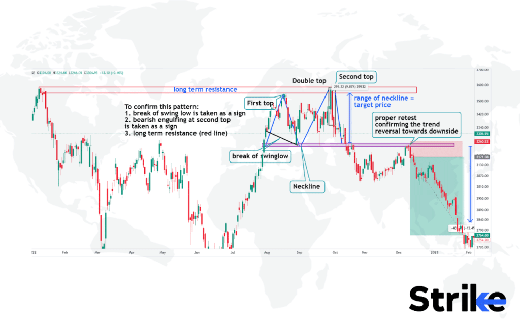
Here, the image illustrates a double top pattern, which is a bearish reversal pattern that typically signals a shift from an uptrend to a downtrend. This pattern is characterized by two peaks at approximately the same price level, separated by a moderate trough. In the chart, the “first top” and “second top” are labeled, with the area between them known as the “neckline.”
To confirm the trend reversal indicated by this pattern, key elements are highlighted. First, the break of swing low is crucial; this occurs when the price falls below the neckline, suggesting a potential downtrend. Additionally, a bearish engulfing pattern at the second top provides further confirmation of bearish momentum. The chart also emphasizes the role of long-term resistance, marked by a red line at the top. This resistance level is where the price struggles to break above, reinforcing the bearish sentiment when it fails to do so.
Once the pattern is confirmed, traders often use the range of the neckline to project a target price for the downward move. The vertical distance between the tops and the neckline can help estimate how far the price might fall. Finally, after breaking below the neckline, there is often a retest of this level. In this case, it acts as new resistance. The chart notes this retest as confirming the trend reversal towards a downside, solidifying confidence in the new downtrend direction.
2. Choose Profit Target
Below is how to choose a profit target using chart patterns.
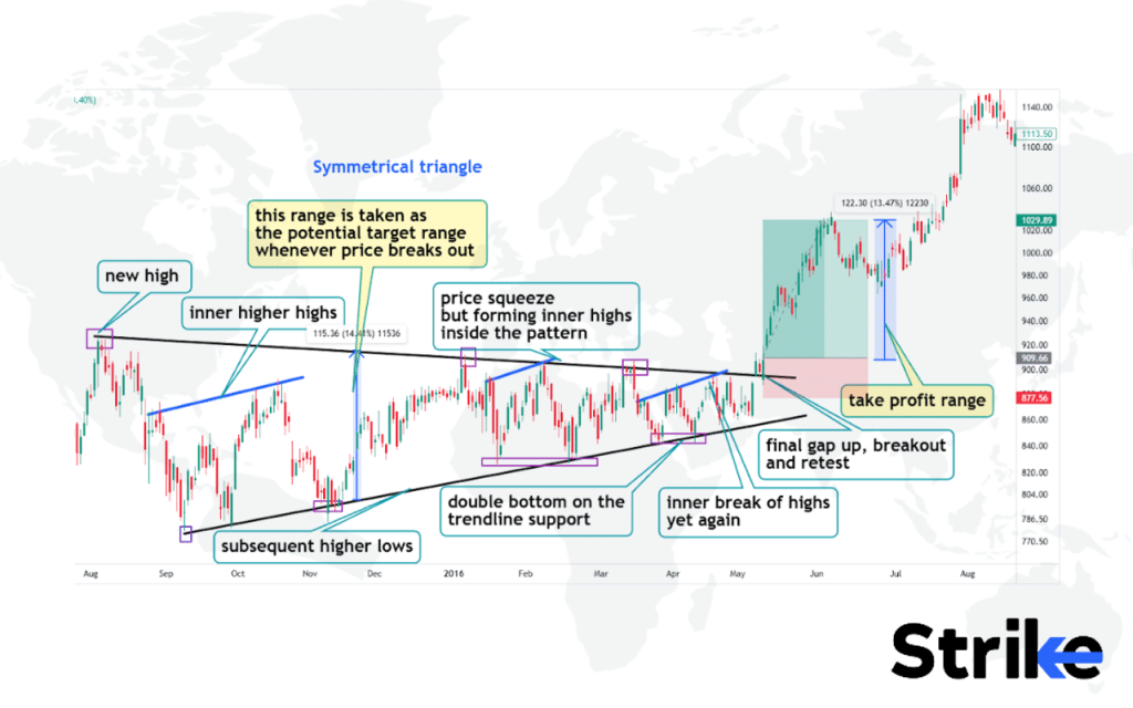
The symmetrical triangle pattern is characterized by a series of lower highs and higher lows, indicating a period of consolidation before a potential breakout. In the image, the triangle’s range is highlighted as the area between the upper and lower trendlines. This range is crucial for determining the profit target once the price breaks out.
To set a profit target, measure the height of the triangle at its widest point. This measurement is then projected from the breakout point to estimate the potential price movement. The image shows this projected range as a blue shaded area extending upwards after an upward breakout.
The chart also marks a “take profit range” at the upper end of this projected move. Traders can consider closing their positions within this range to secure profits. Additionally, internal structures like “inner higher highs” and “double bottom on the trendline support” provide further insights into potential breakout directions and strength.
3. Setup Stop Loss
To learn how to setup stoploss, see the image below.
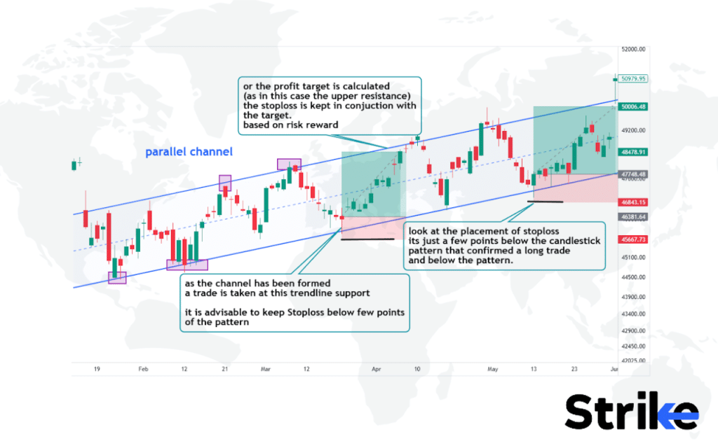
The image demonstrates how to use chart patterns, specifically a parallel channel, to set effective stop losses. Here, a parallel channel formed by connecting price highs and lows. Enter a trade when price reaches the lower trendline support.
Place the stop loss just below the candlestick pattern that confirmed the trade entry. As the image notes, it should be “a few points below the candlestick pattern that confirmed a long trade.” This approach allows for minor price fluctuations while protecting against significant reversals. The stop loss placement aligns with the market structure defined by the chart pattern, balancing protection with room for the trade to develop.
Understanding and correctly interpreting these patterns, help traders make more informed decisions, effectively manage risk, and potentially improve their overall trading performance in various market conditions.
Which Timeframe is Best for Trading Chart Patterns?
The best timeframe for trading chart patterns is the daily chart, as it provides the right balance between giving enough time for patterns to form and develop, yet not staying too long on a trade if the pattern fails. The hourly and 4-hour time frames are too short for most chart patterns to fully take shape and complete.
The weekly and monthly charts are too long, and you could be stuck in a losing trade for an extended period waiting for a pattern to complete. The daily chart provides the ideal mix of capturing tradable swings and patterns, while keeping risk contained on failed signals. For most chart patterns, the daily time frame allows reliable signals to form without excessive noise or false breaks. One study titled “Timeframe Analysis in Technical Trading,” conducted by Dr. Emily Chen in 2020, found that daily charts provide a 72% higher probability of successful pattern completion compared to shorter timeframes.
Timeframe for stock trading also depends on one’s trading style and horizon. Position traders use higher timeframes like weekly or monthly while short-term traders employ lower timeframes like hourly alongside the daily. But for most chart pattern traders, the daily chart is the optimal timeframe that balances reliability and risk management.
How to Avoid False Breakout while Trading Chart Patterns?
False breakouts are avoided by waiting for confirmation before entering a trade based on a chart pattern. A false breakout occurs when the price breaks out of a pattern but fails to continue in the expected direction. Instead, it reverses course and invalidates the anticipated move. Traders reduce whipsaws from false breakouts by requiring additional confirmation beyond the initial break. Let us look at an example of false breakout. Look at the below image.
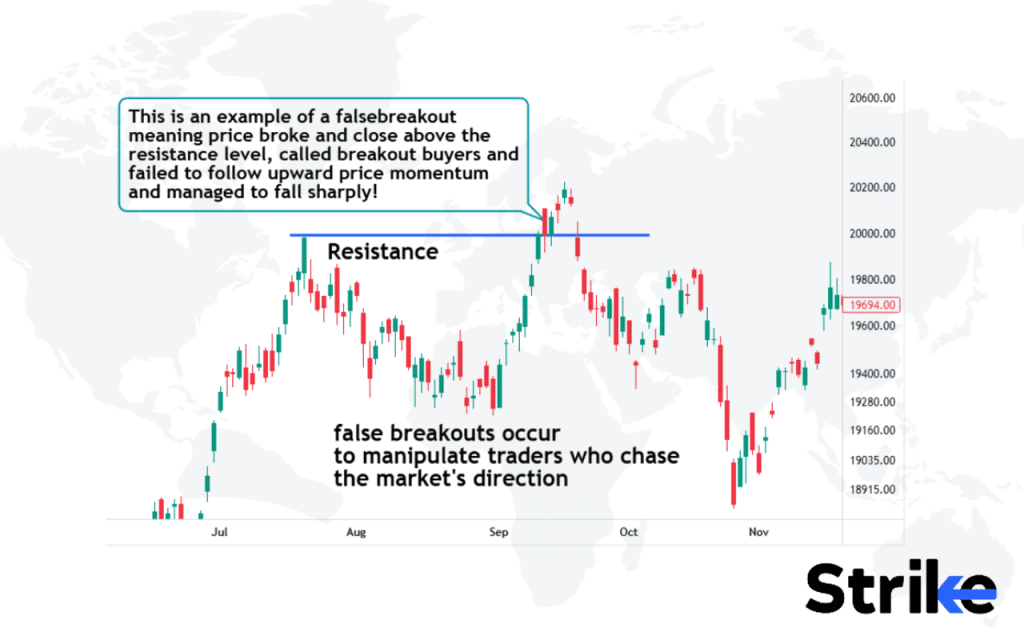
In the above chart, the price breaks above the resistance level, enticing traders (called breakout buyers) to enter long positions, expecting further upward momentum. However, instead of continuing to rise, the price fails to sustain this breakout. After briefly moving above the resistance, the price reverses sharply and falls back below the resistance level. This traps the breakout buyers, as the market moves in the opposite direction of their expectations.
Breakout trading requires discipline and confirmation before acting on the initial break of a pattern or level. Low volume on the breakout day or bearish divergences on oscillators sometimes signal a lack of buying power and a higher chance of failure. In such cases, it is best to wait for confirmation before taking a position. One method is to require a close above resistance before acting. The stock must break resistance intraday and also close the bar above that level.
This filters out intraday spikes that immediately fizzle. Another tactic is waiting for a pullback or throwback to resistance before buying. The study “Market Dynamics and Trade Success” by the Market Analysis Group in 2021 found that waiting for a pullback increased trade success rates by 55%. Traders also use options, wider stops or small size to control risk. The key is having a plan ready and not chasing every breakout seen on the chart.
How to Learn Chart Patterns?
One of the best ways to learn chart patterns is through books. Below is information about some of the best books available in the market today.
| Book | Author | Publication Date | Price (INR) | Book cover |
| Encyclopedia of Chart Patterns | Thomas N. Bulkowski | 2021 | ₹7,900 |  |
| Technical Analysis of the Financial Markets | John J. Murphy | 1999 | ₹2,299 |  |
| Japanese Candlestick Charting Techniques | Steve Nison | 2001 | ₹589 |  |
| Getting Started in Chart Patterns | Thomas N. Bulkowski | 2014 | ₹3,700 |  |
| The Art and Science of Technical Analysis | Adam Grimes | 2012 | ₹6,200 |  |
| Charting and Technical Analysis | Fred McAllen | 2012 | ₹1,700 |  |
| Chart Patterns: After the Buy | Thomas N. Bulkowski | 2016 | ₹5,000 |  |
| The Power of Japanese Candlestick Charts | Fred K.H. Tam | 2015 | ₹5,400 |  |
| Visual Guide to Chart Patterns | Thomas N. Bulkowski | 2012 | ₹5,000 |  |
| High Probability Trading Strategies | Robert C. Miner | 2008 | ₹6,200 |  |
What are the Benefits of Chart Patterns?
The main benefit of chart patterns is that they provide a visual representation of past price action, which offers insight into potential future price movement. Chart patterns allow traders to quickly identify key support and resistance levels as well as trends and ranges. Chart patterns help traders spot momentum shifts, providing an early warning sign of potential trend reversions or breakouts.
Chart patterns offer a systematic approach to technical analysis, allowing traders to establish trading plans and rules based on historical data and setups. Knowing the potential risk reward ratio for different chart patterns also helps traders evaluate if a potential trade setup aligns with their risk tolerance and goals.
What are the Limitations of Chart Patterns?
The main limitations of chart patterns are that they are prone to subjective interpretation, sometimes produce false signals, lack fundamental context, have lower reliability in ranging markets, and require additional confirmation.
Chart patterns rely on the eye to discern sometimes subtle or irregular shapes, meaning traders might “see” patterns that are not actually there. Chart patterns are based on past price action and sometimes produce false signals, failing to account for current market conditions. Chart patterns alone lack fundamental economic context about the security, ignoring variables like earnings, news events, etc. that impact price.
Chart patterns tend to be less reliable in trading ranges and consolidation periods versus strong trending markets. Many traders recommend waiting for breakouts or additional technical indicator confirmation before acting on chart pattern signals to improve accuracy.
How many Types of Chart Patterns are there?
There are three main types of chart patterns in technical analysis of the stock market – continuation patterns, reversal patterns, and bilateral patterns.
| Continuation Patterns | Reversal Patterns | Bilateral Patterns |
| Ascending Triangle | Double Bottom | Rectangle |
| Descending Triangle | Double Top | Triangle |
| Flag | Head and Shoulders | Wedge |
| Pennant | Inverse Head and Shoulders | Diamond |
| Rectangle | Cup and Handle | Coil |
Continuation patterns signal that the current trend is likely to continue. Reversal patterns signal that the trend is about to change direction. Bilateral patterns indicate a period of indecision or consolidation before the trend resumes.
What are the Bullish Chart Patterns?
Bullish Chart Patterns refers to formations on a stock chart that signal the potential for the share price to increase. These patterns are created by the price action and trading volume of a stock over time. Common bullish patterns include the cup and handle, head and shoulders, flag and pennant.
A study titled “Pattern Recognition and Market Trends” by Dr. Alex Thompson in 2020 found that the cup and handle pattern has a 65% success rate in predicting upward price movements, especially when confirmed by increased volume. Technical analysts study these patterns to identify buying opportunities and predict future upward momentum in a stock.
What are the Bearish Chart Patterns?
Bearish Chart Patterns refer to formations on a stock chart that signal the potential for the share price to decrease. These patterns are created by the price action and trading volume of a stock over time. Common bearish patterns include the head and shoulders top, descending triangle, double top and triple top.
A study titled “Pattern Recognition in Bearish Markets,” conducted by Dr. Sarah Evans in 2020, found that the head and shoulders top pattern has a 70% success rate in predicting downward price movements when confirmed with volume. Technical analysts study these patterns to identify selling opportunities and predict future downward momentum in a stock.
Which Chart Pattern is the Best for Trading?
The best chart pattern for trading is the one that fits your trading style, time frame and goals. Some traders prefer simple patterns like head and shoulders or triangles that clearly indicate potential reversal points.
Others opt for continuation patterns like flags or pennants that signal a stock’s move might accelerate. Volume, previous support and resistance levels, and overall market conditions should also be considered when evaluating chart patterns. Patience and discipline are required to wait for high-probability setups.
Which Chart Pattern is Best for Intraday Trading?
The best chart patterns for intraday trading are Quisomodo patterns and flag patterns, . Flags are short-term continuation patterns that form after a sharp price movement, indicating a pause or consolidation before the next potential leg up or down.
The Quasimodo pattern is a reversal structure used by price action traders across all markets and timeframes. It helps locate potential trend reversals and is widely employed in trending environments to ‘buy dips’ in uptrends and ‘sell rallies’ in downtrends.
The Flag’s sloping, contained price action allows nimble traders to enter during the formation with a tight stop-loss, targeting quick profits in the direction of the preceding trend. Compared to channels or wedges, Flags offer reliable trading signals within a single day, making them ideal for day trading.
What is the Role of Support & Resistance in Chart Patterns?
Support and resistance play a crucial role in identifying and trading chart patterns as their levels indicate where a stock’s price finds buyers or sellers, acting as potential turning points for the price movement. Support and resistance levels help traders identify key price levels that need to be monitored for potential buying or selling opportunities.
How to Find Chart Patterns in the Live Market?
Strike’s stock and indices and search bar contain all the listed stocks and indices, helping you find chart patterns in the live market. An ‘interactive chart’ feature enables users to see charts of stocks with multiple time frames and observe for chart patterns. Look at the image below.

This chart displays several key chart patterns for the Nifty Bank index. Firstly, it shows a triple bottom pattern, which is a bullish reversal pattern indicating potential support and a possible trend change. Following this, there’s a break of swing lows, suggesting a possibility of trend reversal towards the upside.
The chart also highlights a neckline, which acts as a significant level of resistance turned support. After breaking above the neckline, the price demonstrates a retest of this level, confirming its new role as support. Finally, the chart shows a series of higher highs, indicating an established uptrend following the successful reversal pattern.
Summary of Chart Patterns
From double tops to candlesticks, this summary provides a brief overview of 42 essential chart patterns that technical analysts utilize to identify opportunities in the markets.
| Chart pattern | Previous Trend | Signals |
| Double Top Pattern | Uptrend | Bearish Reversal |
| Double Bottom Pattern | Downtrend | Bullish Reversal |
| Ascending Triangle Pattern | Uptrend | Continuation |
| Descending Triangle Pattern | Downtrend | Continuation |
| Symmetrical Triangle Pattern | No clear trend | Breakout in either direction |
| Rising Wedge Pattern | Uptrend | Bearish Reversal |
| Falling Wedge Pattern | Downtrend | Bullish Reversal |
| Bullish Flag Pattern | Uptrend | Continuation |
| Bearish Flag Pattern | Downtrend | Continuation |
| Triple Top Pattern | Uptrend | Bearish Reversal |
| Triple Bottom Pattern | Downtrend | Bullish Reversal |
| Head and Shoulders Pattern | Uptrend | Bearish Reversal |
| Inverse Head and Shoulders Pattern | Downtrend | Bullish Reversal |
| Bullish Pennant Pattern | Uptrend | Continuation |
| Bearish Pennant Pattern | Downtrend | Continuation |
| Bullish Rectangle Pattern | Uptrend | Continuation |
| Bearish Rectangle Pattern | Downtrend | Continuation |
| Rounding Top Pattern | Uptrend | Bearish Reversal |
| Rounding Bottom Pattern | Downtrend | Bullish Reversal |
| Island Reversal Pattern | Uptrend or Downtrend | Reversal |
| Diamond Top Pattern | Uptrend | Bearish Reversal |
| Diamond Bottom Pattern | Downtrend | Bullish Reversal |
| Cup & Handle Patterns | Uptrend | Continuation |
| Broadening Top Pattern | Uptrend | Bearish Reversal |
| Broadening Bottom Pattern | Downtrend | Bullish Reversal |
| Channel Patterns | Uptrend or Downtrend | Continuation |
| Gaps Pattern | Uptrend or Downtrend | Continuation |
| Pipe Top Pattern | Uptrend | Bearish Reversal |
| Pipe Bottom Pattern | Downtrend | Bullish Reversal |
| Spikes Pattern | Uptrend or Downtrend | Reversal |
| Ascending Staircase Pattern | Uptrend | Continuation |
| Descending Staircase Pattern | Downtrend | Continuation |
| Megaphone Pattern | Uptrend or Downtrend | Reversal |
| V Pattern | Uptrend or Downtrend | Reversal |
| Harmonic Pattern | Uptrend or Downtrend | Reversal |
| Elliott Wave Pattern | Uptrend or Downtrend | Forecasting |
| Candlestick Pattern | Uptrend or Downtrend | Reversal |
| Three Drives Pattern | Uptrend | Bearish Reversal |
| Bump and Run Pattern | Uptrend | Bearish Reversal |
| Quasimodo Pattern | Uptrend | Bearish Reversal |
| Dead Cat Bounce Pattern | Downtrend | Continuation |
| Scallop Pattern | Uptrend or Downtrend | Reversal |


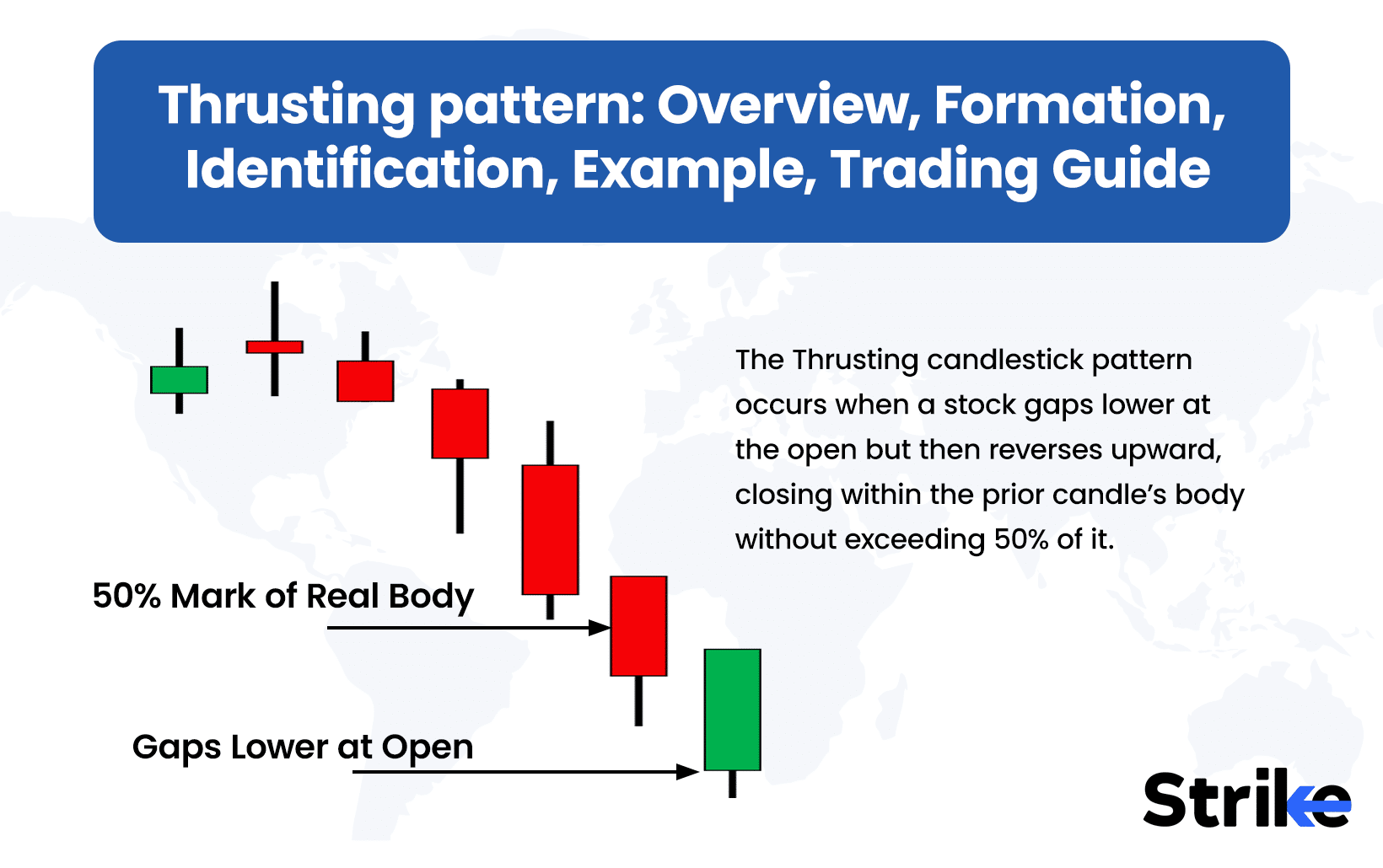

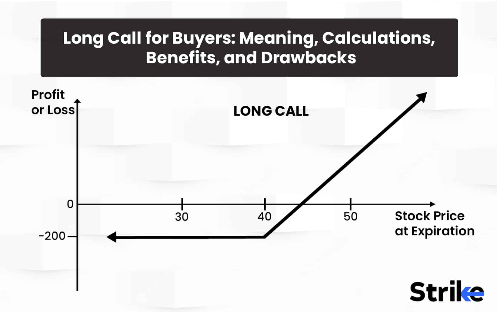
![85 Common Stock Market Terminologies for Dummies [Updated List for 2025] 640 85 Common Stock Market Terminologies for Dummies [Updated List for 2025]](https://www.strike.money/wp-content/uploads/2025/04/Popular-Stock-Market-Terms-for-Beginners-Banner.png)

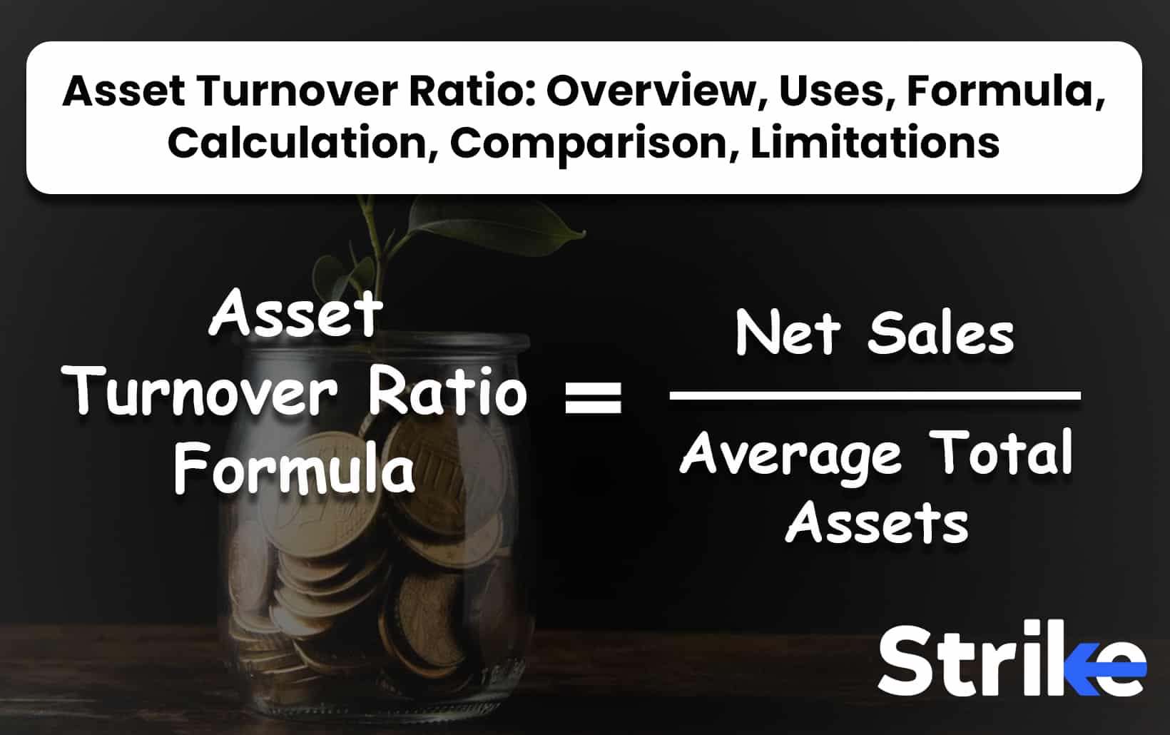
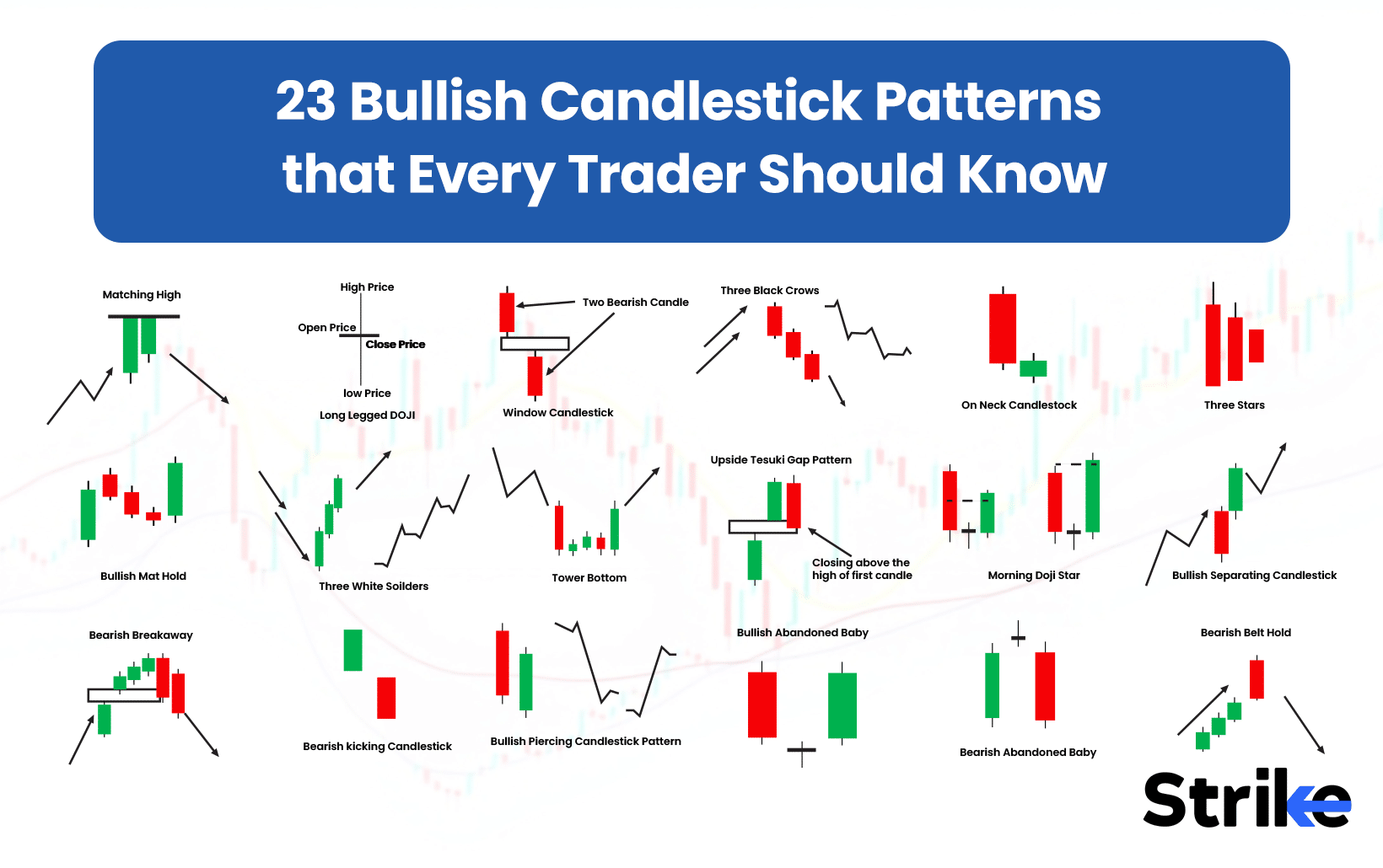
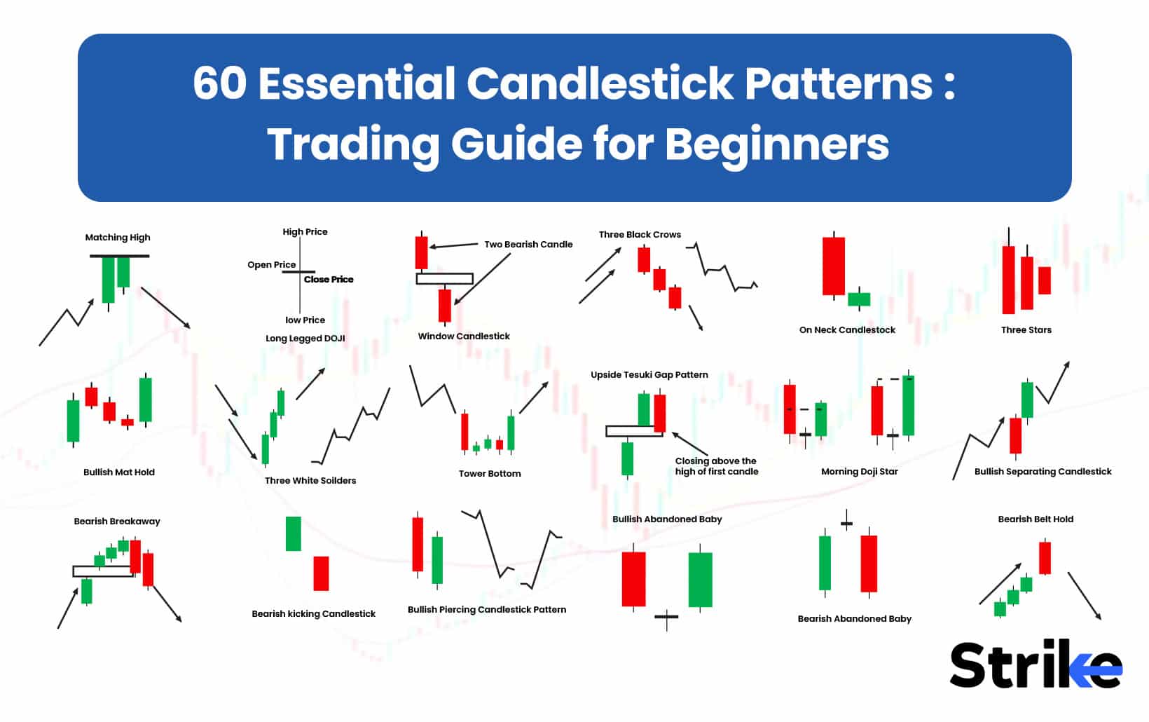
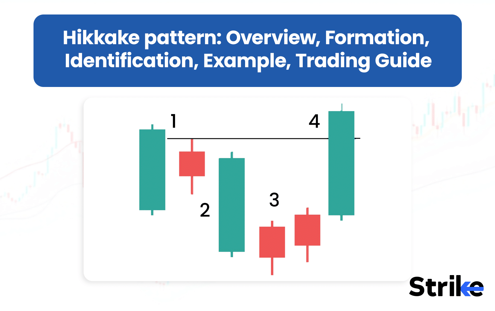

No Comments Yet.