
Technical indicators for options trading provide insights into market conditions to help traders identify optimal entry and exit points for trades. Technical indicators are used by options traders to analyze trends, volatility, volume, momentum and sentiment.
Open interest shows total outstanding option contracts and helps gauge sentiment. Implied volatility reflects expectations of future volatility priced into options. Put/call ratio signals overbought or oversold conditions when sentiment becomes overly bullish or bearish. Option greeks like delta, gamma, theta and vega measure an option’s sensitivity to price, volatility and time. Max pain calculates the underlying price where most options expire worthless. Volatility skew shows the difference in implied volatility between various strike prices.
Momentum indicators like MACD and RSI spot divergences and overextended moves are ready to reverse while VWAP and moving averages identify dynamic support and resistance levels for entries and exit. Bollinger Bands identify support and resistance levels that contain price. Volume indicators like on-balance volume confirm price breakouts. The super trend plots the overall trend direction useful for timing entries. Traders optimize entries and exits by combining signals from multiple indicators to filter out false moves.
Matching indicator time frames to option expiration dates provides the most relevant data. Adapting settings based on market volatility prevents false signals. Mastering technical analysis gives traders an analytical edge to boost probability of profitable options trades.
Open Interest (OI)
Open interest refers to the total number of outstanding option contracts that have been traded but not yet liquidated by an offsetting trade or exercise. Open interest is a measurement of market depth and liquidity. For each buyer of an options contract, there must be a seller; open interest represents one side of the contract.
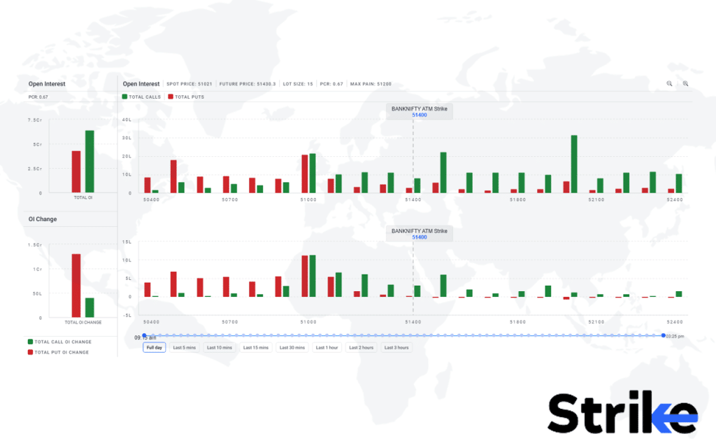
This image shows the open interest profile of Banknifty as an underlying asset. The upper section is called total open interest and the lower section represents the Open Interest change figures. The red bars indicate open interest figures for puts whereas the green bars are representing open interest figures for calls.
Total open interest figures help traders understand how option sellers are adamant in holding their positions on that particular strike price, it works as an approximate resistance or support level for calls and puts. The total open interest figures tend to assist traders in studying the sentiment of the market.
The lower section denotes open interest change figures. OI change is useful as it indicates how the positions are shifting between various strikes and calls or puts. It helps traders understand if markets are poised to show momentum or stay range bound. These figures are crucial as they help traders in speculating upcoming huge moves as they speculate possibilities of unwinding of contracts on different strikes.
Now, let us look at multistrike OI.
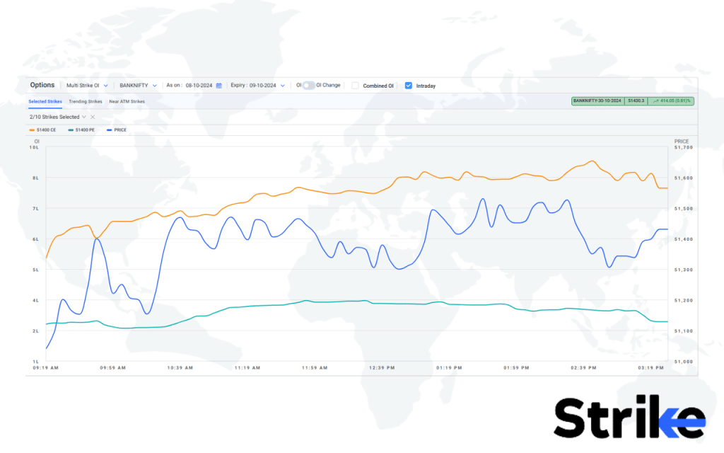
This image shows the multi-strike open interest figures for various strikes in a graphical representation with respect to the spot price of the underlying asset, as in this example; Banknifty.
This analysis plots the contracts (open interest) on the right y-axis whereas the price of the underlying asset is on the left y-axis. The time is plotted on the x-axis.
Multistrike open interest feature of strike allows traders to plot multiple strike prices of calls and puts on the graph to study the behaviour of contracts with respect to time and price of the underlying asset. It helps by tracking how OI changes at different strike prices as the spot price moves, you will be able to detect shifts in bullish or bearish sentiment over time for example, increasing call OI at higher strikes signals growing bullishness.
Finally, below is the cumulative OI.
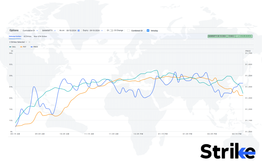
This is the cumulative OI, it is quite different from multistrike OI as this feature combines all the open interest for calls and puts and plots specific lines with respect to the price of the underlying asset and time on the axis.
This feature enables traders to study open interest movement of calls and puts with respect to time and price and to study the general trend of the underlying asset as opposed to multi-strike OI study which specifically helps in studying the positions of option sellers on various strike prices.
Implied Volatility (IV)
Implied volatility refers to the market’s expectation of potential price fluctuation in the future. Implied volatility is a key metric calculated into the premium of an options contract using a pricing model like Black-Scholes. Implied volatility looks at actual option prices to work backwards and deduce what the market implies the volatility of the underlying will be. Look at the below image.
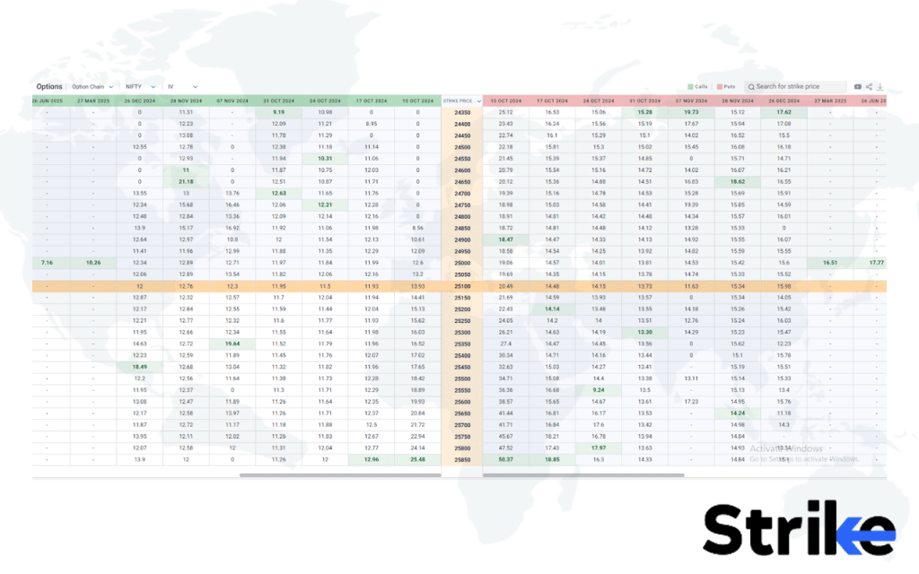
Strike helps you track IV in an easier way, in which intrinsic volatility for both calls and puts are tracked with respect to various expiries jolted down in the column forms. This is how IV on specific calls and puts could be studied in this useful way.
Put Call Ratio (PCR)
The put/call ratio (PCR) is a sentiment indicator that measures trading volume activity between put and call options. The put/call ratio (PCR) gauges the mood of options traders to determine if excessive bullish or bearish sentiment is due for a reversal.
The PCR is calculated by dividing the put volume by the call volume. A high PCR reading above 1.0 indicates bearish pessimism, with more put volume relative to calls. It suggests downside protection demand and oversold conditions. A low PCR below 0.7 reflects euphoric complacency, with the heaviest call option activity signalling an overbought peak.
As a contrarian sentiment indicator, extremes in the PCR often coincide with turning points in the market. Wise option traders analyze PCR data to position for reversals at oversold bottoms or overheated tops. Below is the graphical representation of the same.
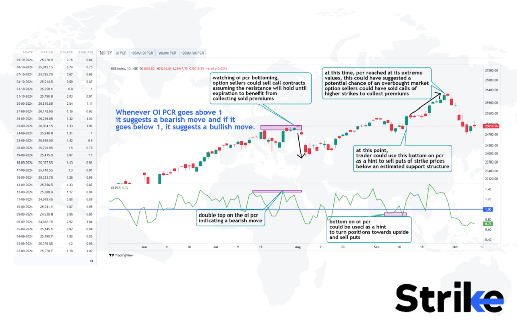
OI PCR is a tool available on strike to study the Open Interest of Put and Call Ratio (OI PCR). It is an important tool for understanding market sentiment and spotting overbought and oversold situations.
In this example, you will be able to observe in the chart that the indicator is quite helpful in guessing the probable future direction of the underlying asset.
Double bottoms and tops on the PCR indicator are quite useful in speculating future market direction which could be used to sell calls or put options of appropriate strike prices taking risk management in consideration. Traders also tend to spot divergences between price and PCR data to speculate future price direction.
Research published by Dr Meera Nair at the National Institute of Securities Markets (NISM) titled “The Predictive Power of the Put/Call Ratio in Equity Markets” (2021) found that extreme PCR readings above 1.2 often preceded market reversals, with an 80% accuracy rate in identifying short-term bottoms.
Option Greeks
Option Greeks refer to the various risk sensitivities associated with options trading. They measure how option values fluctuate in response to various variables. The most common Greeks are delta, gamma, theta, vega, and rho.
- Delta – Indicates the amount and option price changes relative to an Rs1 move in the underlying asset price. It reflects the option’s price sensitivity and directional bias.
- Gamma – Measures the rate of change in an option’s delta. It shows how much exposure changes as the underlying moves. Higher gamma risks bigger profit swings.
- Theta – Reflects time decay or the rate of change in an option’s value relative to time. Negative theta indicates the option loses value as expiration nears.
- Vega – measures sensitivity to implied volatility changes. If IV rises, vega indicates how much the option price increases. Vega risk is highest for long-dated options.
- Rho – Calculates an option’s sensitivity to interest rate changes. Rising rates negatively impact call values but increase put premiums.
Below is how Strike helps track option Greeks of a stock.
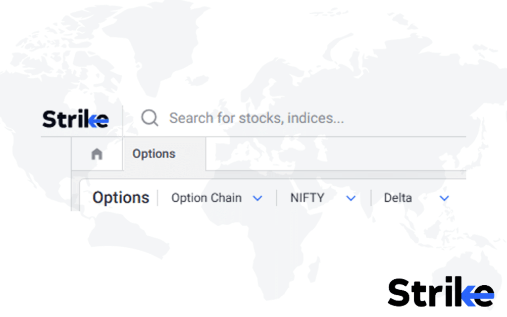
Using this drop-down menu adjacent to ‘Nifty’, you will be able to track and plot Greeks like Delta, Gamma, Theta and Vega. The screen appears as below.
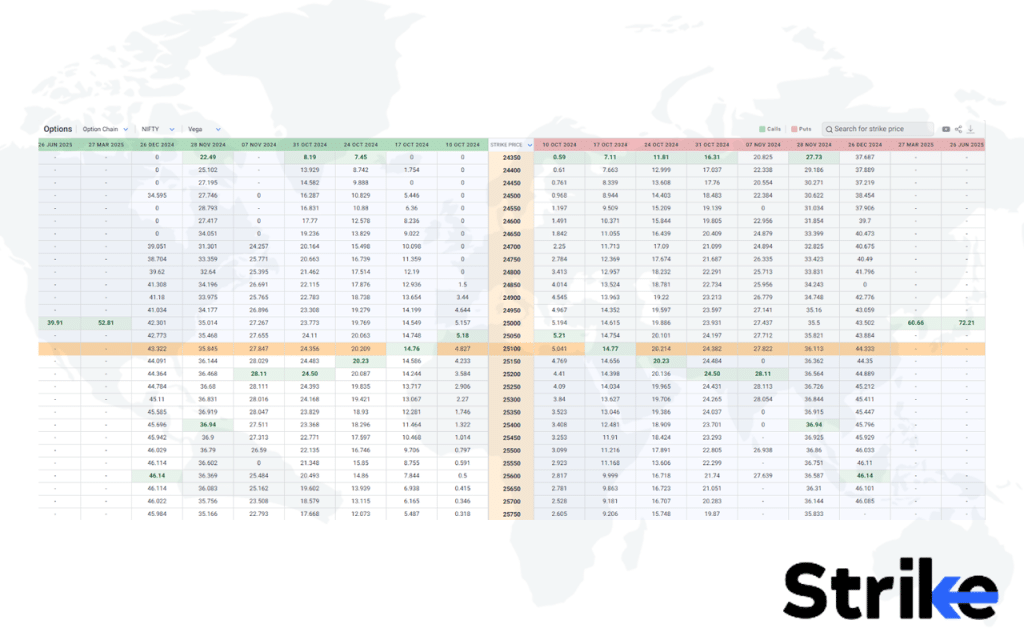
This is the option chain of Vega for calls and puts with respect to multiple expiries (current and upcoming). These values for specific calls and puts could be studied in this format for understanding option activity on specified strike prices to observe upcoming market sentiment.
The coloured bars suggest higher IVs for specific strike prices in calls and puts have important implications for options traders. Implied volatility represents the market’s expectations of future volatility in the underlying asset and directly affects the price (premium) of an option.
It also suggests expectations of increased volatility on specific strike prices, and large price movements, High IV for specific strike prices can also indicate a supply-demand imbalance in the options market.
Max Pain
Max pain is an indicator for option trading that refers to the underlying stock price at which the maximum number of options contracts expire worthless. Max pain is calculated by analyzing the outstanding put and call open interest at various strike prices to determine the stock price that would cause the maximum loss to option buyers.
At this stock price level, called the max pain point, the largest number of put and call options will expire out of the money. See the graph below.
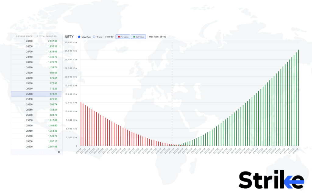
This image displays the max pain chart for Nifty 50, which is a key concept in options trading. Max pain refers to the price level at which the majority of options (both calls and puts) will expire worthless. This provides useful insights for option sellers, as they might consider selling strikes near the maximum pain level while factoring in risk management and market uncertainty.
For option buyers, max pain serves as a warning. If the underlying asset expires around this level, it could result in their positions turning into losses. Therefore, they want to consider exiting their positions before expiry.
To help option traders observe how max pain trends influence the underlying asset’s price over time, the platform Strike offers a feature that tracks both price and max pain for several days.
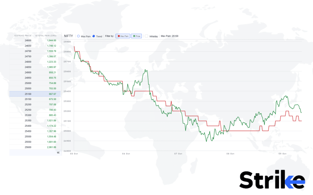
In the image, the x-axis represents the date, while the price of the underlying asset is depicted by a green line and the max pain level by a red line. This is a non-intraday graph that shows the relationship between the asset’s price and max pain over time.
It’s observed that whenever the price diverges from the max pain level, it tends to eventually converge back to the red line. This demonstrates how max pain is used to predict price movements, particularly as expiration approaches. Since the price acts like a magnet towards the max pain level, option writers often hedge their positions in a manner that pulls the stock price closer to this level, thereby potentially minimizing their risk.
In addition to its predictive power, Max Pain also provides insights into market sentiment and potential trading opportunities. Suppose a trader holds an option position and notices a significant difference between the current price and the max pain level, then they will be able to adjust their strategy accordingly to avoid being caught on the wrong side of price movements as expiration nears.
Volatility Skew
Volatility skew refers to the difference in implied volatility between out-of-the-money put and call options for the same underlying asset and expiration date. Volatility skew is an indicator for option trading that measures the relative demand for options at various strike prices.
Volatility skew occurs when implied volatility is higher for lower-strike put options compared to call options with higher strike, creating an asymmetry in the volatility surface. See the image below.
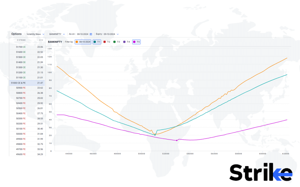
This image illustrates the volatility skew for the selected underlying asset, which in this case is BankNifty. On the left side, there is a table displaying strike prices alongside their respective implied volatility (IV) values.
Volatility skew shows how volatility is distributed across different strike prices. This is useful for traders to identify whether IV is increasing or decreasing, which helps them manage their positions more effectively.
The skew also allows traders to track how the volatility graph changes over time for specific strike prices. The yellow line represents the IV of the current at-the-money (ATM) options, specifically the 51000 Call (CE) and 51000 Put (PE) options for the current trading day. The T-1 line, shown in light blue, represents the IV values from the previous trading session, while the pink line represents IV values from T-5, or five trading days ago.
By observing the significant shift in IV from lower levels to higher levels, traders gain insights into how volatility has evolved. This feature helps them understand IV trends for the underlying asset over the course of several days, which is critical for making informed trading decisions.
Strike Price
The strike price is the set price at which a stock option is bought or sold when exercised. The strike price is a key indicator for option trading strategies in India. For example, say nifty 50 is trading at 25100. a nifty call option with a 25000 strike price would be in the money since the strike is below the cmp. (25100). An atm call option would be a 25100 strike. OTM call options will be above the cmp 25100. See the below image.
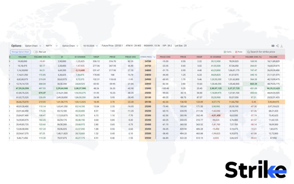
This is the option chain of Nifty 50. The middle vertical yellow column is all the strike prices of calls and puts. These strike prices are price points of the underlying asset and traders speculate what price point or strike price is supposed to be defended until the expiry concerning calls and puts.
Relative Strength Index (RSI)
The Relative Strength Index (RSI) is a technical indicator that measures the speed and magnitude of recent price changes to analyze overbought or oversold conditions in a stock or asset. It is displayed as an oscillator that moves between 0 and 100. Monitoring the RSI oscillator over time identifies when a stock is ready to reverse based on extreme overbought or oversold readings.
Traders combine the relative strength index analysis with other indicators like price action time entries and exits. Let us understand this better through an example.
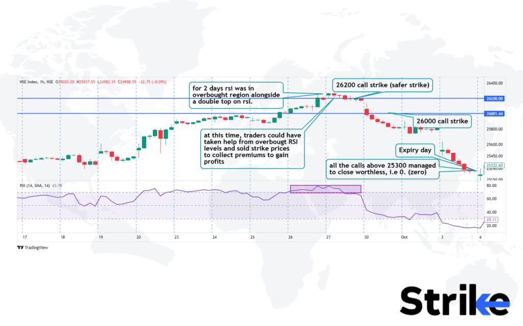
In this example, the RSI (Relative Strength Index) has been added as an indicator to demonstrate how it could have helped with a specific trade scenario.
Between 26th September and 27th September, the markets were hovering around the 26200 price level. The RSI readings indicated an overbought condition, and there were signs of rejection on the indicator. Traders could have leveraged this information to sell out-of-the-money call options, such as at the 26300 or 26350 strike prices, to collect premiums.
For more aggressive traders using technical strategies, they might have opted to sell *in-the-money* call options to collect higher premiums, based on the expectation that Nifty 50 would close below 26000 by the expiration date on 3rd October 2024. As the market declined, the value of the call options would have decayed, while the premiums for put options would have increased due to the falling market.
This example illustrates how traders use RSI as a tool to inform their option selling or buying strategies, enhancing their technical analysis and decision-making in the market.
Moving Average Convergence Divergence (MACD)
The Moving Average Convergence Divergence (MACD) is a trend-following momentum indicator that shows the relationship between two moving averages of a security’s price. The MACD is calculated by subtracting the 26-period exponential moving average (EMA) from the 12-period EMA.
MACD is displayed as a histogram oscillating above and below a center zero line. Crossovers of the MACD line and signal line generate buy and sell signals. Look at the below image.
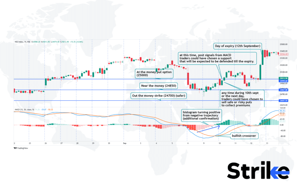
This example demonstrates how the MACD (Moving Average Convergence Divergence) indicator could have been applied to assist option traders in making informed trade decisions.
On the 1-hour time frame, near the end of the trading session on 9th September, MACD signalled a bullish crossover. Additionally, the histogram began to shift into positive territory. This, combined with other technical factors, could have provided a strong confirmation for traders to speculate on the near-term expiry of Nifty. Based on this information, traders might have assumed that the recent low of 24850 would hold and that Nifty would not close below this level by the day of expiry, which was 12th September.
As the market rose and closed above 25300, all put options with strike prices below 25300 expired worthless, while the prices of call options increased during this period.
At the time of the crossover, a trader could have opted to sell out-of-the-money put options for a safer strategy, or taken a riskier approach by selling *at-the-money* or *in-the-money* put options to collect larger premiums.
This example shows how traders use MACD, along with other technical analysis tools, as a confluence to create high-probability trade setups and make more informed decisions in options trading.
Bollinger Bands
Bollinger Bands are a technical analysis indicator that plots bands above and below a simple moving average line on a price chart. The upper and lower bands are typically 2 standard deviations away from the 20-period simple moving average.
Bollinger Bands adjust to changing market volatility and helps identify overbought or oversold conditions for a stock. It indicates that the stock is overbought after a strong uptrend when the price touches the upper Bollinger band. This could present an opportunity to buy put options. Look at the below image.
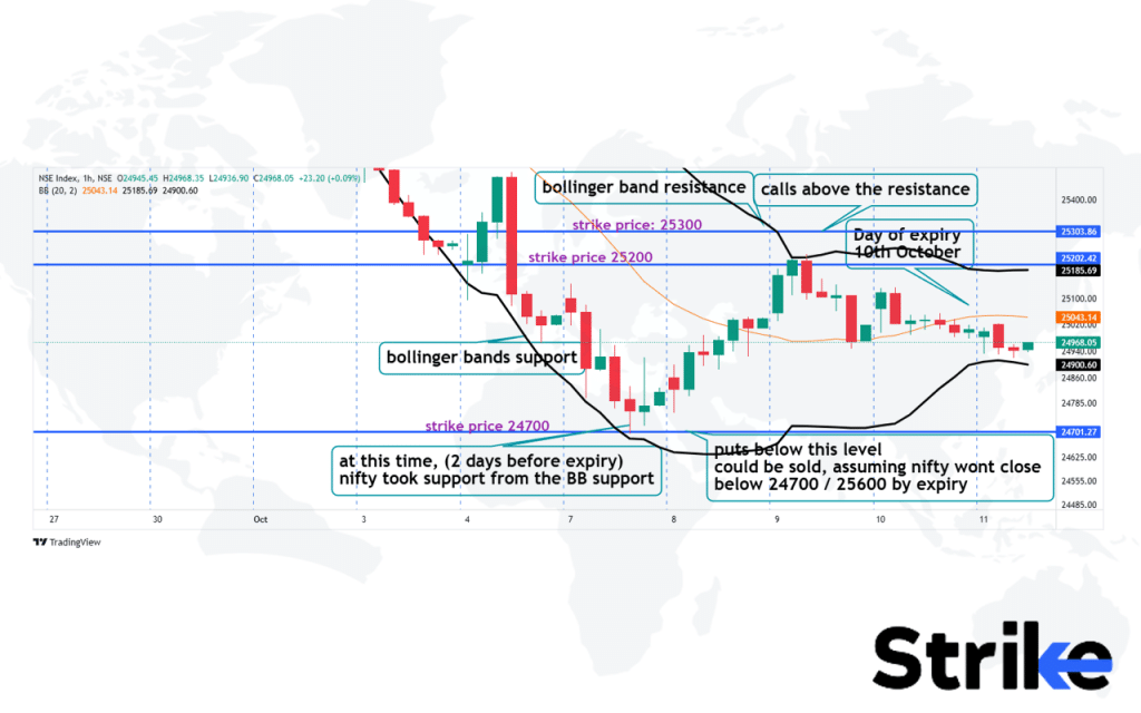
In this example, Bollinger Bands have been applied as an indicator on the chart, demonstrating how they could assist option traders in making trading decisions.
Nifty’s weekly expiry was on 10th October. Three days before expiry, Nifty started finding support at the lower Bollinger Band, which often acts as a support level in technical analysis. Option traders could interpret this bounce off the lower band as a signal that the underlying asset might hold above this level until expiry.
On 7th October, traders could have started positioning themselves by selling put options with strike prices below 24700, anticipating that the support from the lower Bollinger Band would hold. Riskier traders—those with stronger conviction in the support level—might have chosen to sell *in-the-money* put options to collect larger premiums.
The next day, Nifty hit resistance at the upper Bollinger Band. Traders could have used this information to sell call options with strikes above 25300, aiming to collect additional premiums while also hedging their previous put positions.
By the time of expiry on 10th October, Nifty closed between 24700 and 25300. This would have benefited traders who sold both puts and calls, as both options would have decayed in value, expiring worthless, and allowing them to collect the full premiums.
Intraday Momentum Index (IMI)
The Intraday Momentum Index (IMI) is a technical indicator that identifies short-term price momentum and trend strength for actively traded stocks. The Intraday Momentum Index calculates the difference between the current price and the average price over a specified lookback period, usually 10-20 bars. The IMI oscillates above/below a center zero line just like the MACD indicator. See the image below.
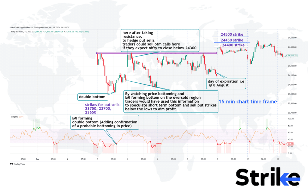
This is an example of how the Intraday Momentum Index (IMI) is useful to option traders when making trading decisions. In this case, the expiration day was on 8th August, and the chart’s time frame is set to 15 minutes.
Three days prior to expiry, the market opened with a significant gap down. By the end of the session, a double bottom had formed on the price chart, and the IMI indicator also showed a double bottom pattern in the oversold region. This signaled a potential trend reversal or a period of trend consolidation.
Option sellers could have used this information to sell put options with strike prices at 23650, or, for those with a stronger conviction, they might have sold *at-the-money* puts at 23750, assuming that Nifty would not breach or close below the chosen strike price by expiry.
The next day, Nifty hit a resistance level, which was marked by a purple rectangle on the chart. Traders could have taken this opportunity to sell out-of-the-money call options, assuming that Nifty would consolidate for the next day or two, with expiry just two days away.
By the time of expiry, all call options with strike prices above 24150 and put options below 24050 expired worthless, benefiting the option sellers who collected premiums from these positions.
Money Flow Index (MFI)
The Money Flow Index (MFI) is a technical oscillator that uses price and volume data to measure buying and selling pressure. The Money Flow Index fluctuates between 0 and 100. An MFI reading over 80 indicates overbought conditions, while below 20 signals oversold conditions. Look at the below chart.

Here are two examples illustrating how the Money Flow Index (MFI) Indicator could be used to inform option trading strategies.
In the first instance, the MFI entered the overbought region and then deflected downward, signalling a potential trend reversal to the downside. During this period, Nifty 50 was also consolidating. Traders could have interpreted this as an opportunity to sell out-of-the-money (OTM) call options, expecting a potential price decline while ensuring they maintained proper risk management and hedging strategies to protect against adverse price movements. The goal would be to profit from the premiums collected as the market potentially moves sideways or down.
The second scenario revolves around the Nifty 50 expiration on 12th September 2024. Three to four days before expiry, Nifty 50 experienced a sharp correction, finding support around the 24800 price level. During this correction, the MFI entered the oversold region and then bounced back into the normal range, suggesting a possible trend reversal.
On 9th September, Nifty 50 took support at the previous day’s low and broke through minor resistance levels, forming a bullish candlestick pattern. This combination of technical signals, including the MFI bounce and the price action, could have been enough for option sellers to start writing put options at safer strike prices (e.g., below 24800) or, for riskier traders, to sell puts at closer or at-the-money (ATM) strikes. The assumption would be that Nifty 50 would not breach the 24800 support level by expiry, allowing traders to profit from the premiums collected as the puts expire worthless.
In both instances, the MFI provides insights into market conditions, helping option traders align their strategies with potential trend reversals while taking risk management into account.
Volume Weighted Average Price (VWAP)
The Volume Weighted Average Price (VWAP) is a trading benchmark that shows the average price at which a stock has traded throughout the day in relation to volume. VWAP calculates a running total of transactions, multiplying price x volume for every tick over a specified timeframe.
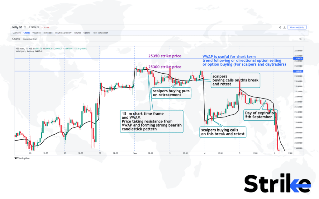
In this example, Nifty’s expiry date was on 5th September. Three days before expiry, on a 15-minute time frame chart, it was observed that Nifty was facing strong resistance from the highs of 2nd September as well as the VWAP level. Candles sharply closed below the VWAP, indicating potential trend consolidation or a possible trend reversal to the downside.
Traders could use this information to sell out-of-the-money call options, expecting premiums to decay, and thus target profitability. Traders with a stronger conviction could even sell in-the-money call options to collect larger premiums, assuming that the market would not rise above their strike prices. More conservative traders might opt to sell calls above 25350, where they believe the market is unlikely to rise before expiry.
This is how VWAP is used to make informed decisions and take trades in options, providing insights into potential market direction while managing risk effectively.
Supertrend
The Supertrend indicator is a technical analysis tool that uses the Average True Range and current price to plot trading signals on a chart. It aims to identify the overall trend and price volatility. The Supertrend line changes colour between green and red when the trend switches between upside and downside. Below is an example.
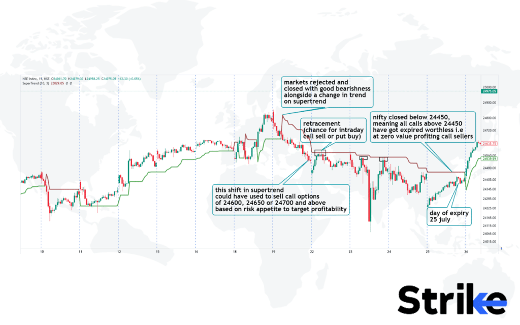
This is an example of how the Supertrend indicator is used to buy or sell options, with a specific focus on a Nifty 50 trade leading up to the weekly expiry on 25th July.
Five days prior to expiry, when option premiums were still costly due to the time remaining until expiration, the market experienced a sharp fall from the top, shifting the trend from bullish to bearish. At the same time, the Supertrend indicator switched from green to red, signaling potential bearishness. Traders could have used this information to sell call options at strike prices above the Supertrend level (24750 and above).
Option sellers could have sold calls at strikes like 24800 and above, under the assumption that Nifty would not close above 24750 by the time of expiration. This strategy would allow them to collect premiums while betting that the market would remain below the resistance level indicated by the Supertrend.
In addition to this, the Supertrend provided additional short-term trading opportunities during retracements when the price touched the Supertrend level, as highlighted by the black boxes in this example. Traders could have taken advantage of these moves to enter quick, intraday trades.
This example shows how the Supertrend indicator is helpful for option traders, enabling them to make informed trades while maintaining tight risk management. During the market’s downward movement, the value of put options would have increased significantly, making it crucial for traders to manage their positions carefully to avoid losses.
Why Technical Indicators Matter in Options Trading?
Technical indicators matter in options trading because they help traders identify optimal timing and market conditions to enter and exit trades based on analyzing volatility and predicting price movements.
- Timing and Market Conditions: Technical indicators help options traders determine when markets are overbought or oversold and identify turning points and breakouts to optimize trade entries and exits. The time frame for Trading used for the indicators impacts their usefulness, as shorter timeframes are better for short-term options while longer timeframes suit options with farther-out expirations.
- Volatility and Price Movement: Options prices are highly sensitive to volatility, so indicators like Bollinger Bands and the Average True Range help traders gauge periods of expansion/contraction in volatility and anticipate pending price movements.
Mastering technical analysis gives options traders an edge by revealing probabilities for profit on data-driven, objective signals.
How to Use Technical Indicators while Trading Option?
Technical indicators, when used properly, help options traders determine optimal entry and exit points by revealing overbought or oversold conditions, support and resistance levels, trend direction, momentum, and volatility. Below is more information.
Combining Multiple Indicators for Accuracy
Relying on just one indicator often produces false signals, so using two or more indicators together creates more reliable trading signals. For example, combining trend-following indicators like moving averages with VWAP and momentum indicators like the MACD confirm emerging trends and overbought/oversold levels. Using the Bollinger Bands volatility indicator along with volume indicators validates breakouts and suggests appropriate options strategies. By corroborating signals from multiple technical indicators, traders filter out false moves and more precisely time entries and exits in the options market.
Time Frames and Expiration Dates
The time frame chosen for technical indicators impacts their usefulness for options expiring on different dates. Shorter time frames like 5 or 15 minutes are best for near-term options while longer daily or weekly charts suit options with farther out expirations.
Traders should ensure the time period shown in the indicator aligns with the options contract expiration date. For example, overbought/oversold levels on an RSI daily chart signal entry point for monthly options while hourly RSI could be used for weekly options. Matching indicators to expiration dates filters out irrelevant signals and provides the most applicable data.
Avoiding Common Pitfalls
Traders should be aware of some common mistakes to avoid losses when using indicators. Don’t rely on any single indicator as each one has weaknesses that lead to false signals if used alone. Avoid overcomplicating your analysis with too many indicators which generate conflicting signals and analysis paralysis. Don’t let preconceived biases influence your trading decisions as technical analysis should drive objective data-based options trades.
Adjusting Indicators Based on Market Volatility
Since options prices are highly sensitive to volatility, traders need to tweak technical indicators during periods of expanding or contracting volatility. Increase the period lengths or width of bands for indicators like Bollinger Bands to account for wider price swings when volatility spikes.
Lower volatility means decreasing the time frames and tightening bands to adjust for narrower ranges. Test different input values and periods by back testing on historical data to optimize indicators for shifting volatility conditions. Adapting key settings allows traders to make technical indicators more robust and prevent false signals regardless of market volatility.
What is the most reliable indicator for options trading?
For options traders, the volume weighted average price (VWAP) is one of the most reliable technical indicators. The VWAP benchmarks the average price based on both volume and price, making it a dependable measure of intraday support and resistance levels for entering and exiting options trades.
Intraday Momentum Index is often considered the another reliable indicator for options trading.
The volume-based on balance volume (OBV) indicator confirms price trends and signals potential reversals better than price-only indicators. Bollinger Bands adapt to volatility and identify upcoming breakouts to capitalize on with long/short options strategies. Momentum oscillators like the relative strength index (RSI) identify overbought and oversold levels useful for timing option entries.
Can I use stock indicators for options trading?
Yes, most technical indicators used for analyzing stocks are also applied to options trading, with some caveats. The same indicators as VWAP, moving averages, RSI, MACD, Bollinger Bands, etc. identify trends, momentum, volatility for options.
However, options have time decay so indicators will need adjustment for short-term options contracts. Stock volume indicators have limitations since options volume and open interest should also be analyzed. Implied volatility indicators like VIX are specially formulated for options pricing and essential for traders to master. Some custom settings or periods optimize stock indicators for faster options price movements.







No Comments Yet.